Monday, March 31, 2008

Girls Beds

I stumbled across this photo on Apartment Tharapy a few weeks ago (sorry, no link) and haven't stopped thinking about these gorgeous beds since.


I would LOVE to have a beautiful pair of antique twin beds for the girls in our next apartment. I saw some that looked just like these (upholstered in a different fabric) the last time I was at ABC. I'm sure they cost a gajillion dollars though so I'll probably stick to stalking craigslist for the next year.
I stopped in to PBK during one of my (many) shopping excursions while we were on vacation in Arizona this week. I really like this newer line of furniture called Olivia. These could maybe be an alternative to the style of beds in the first photo, although it would be a distant second place. I am dying over the upholstered look.

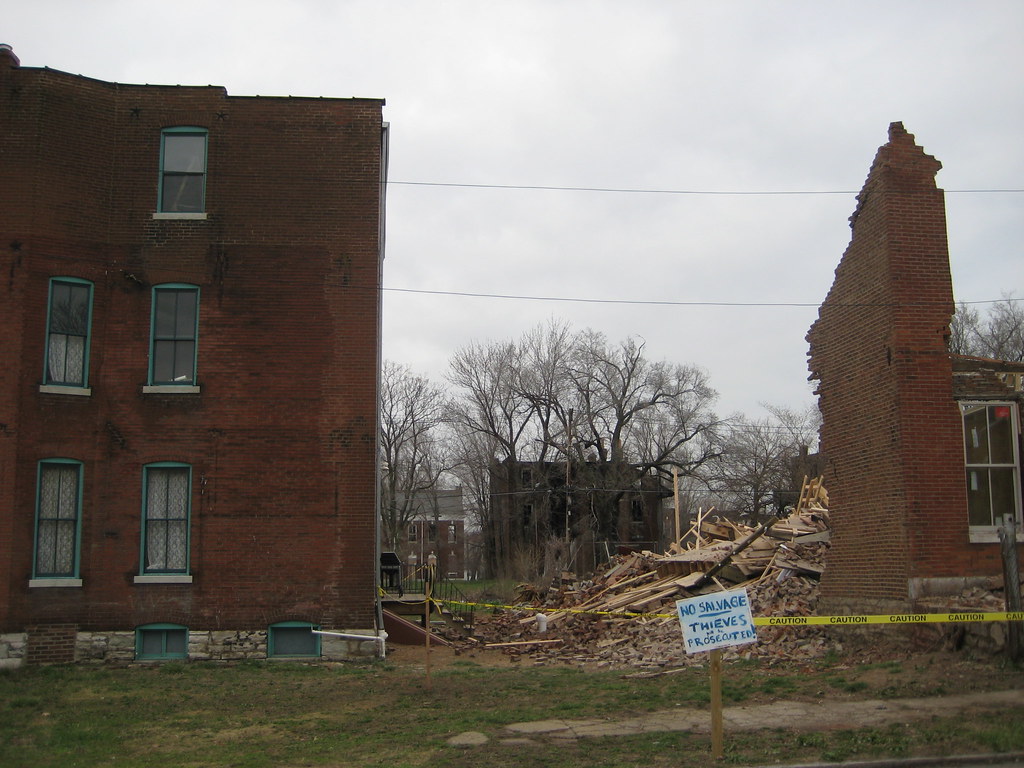
Sad fate of a house on Hebert

No, this is not one of Paul McKee's Blairmont properties. No, it was not the victim of brick rustlers. Until a last Monday this house on Hebert in Old North St. Louis was undergoing a full gut rehab, having been a formerly abandoned LRA property. So you may be asking yourself what the hell happened? What happened is possibly one of the most blatant acts of gross negligence and stupidity I have heard in a long time... over week later I am still trying to wrap my mind around this one.
So the shell work had been completed, including full tuckpointing, masonry re-building in some areas, new floor joists and sub-floor, new windows, new roof, etc. and work had apparently already begun on interior finishes. Apparently there was some foundation underpinning that needed to be done. OK, I'm going to stop here and state the obvious: that foundation underpinning is something you do in small sections at a time. The foundation contractor, who obviously has a complete absence of common sense, excavated the dirt away from the rubble stone foundation all the way to the bottom along the entire east side of the house. This act alone is not advisable for a 100+ year old rubble foundation, as in many cases, they need re-pointing, and exposing the entire length can make the foundation become unstable. Then he precedes to dig under the footing, and keeps digging, until...well you see the result.

To make matters worse than they could have been, the the new floor joists were not simply inserted into the old masonry pockets as they would have been when the house was built. If this were the case, it is feasible that a good part of the shell would still be standing, since the floor and joists would have been able to fall away from the shell. Instead, the genius bolted band boards to the exterior walls and attached the joists to the band boards, so when a portion of one wall started to collapse, the floor structure dragged the rest of the house down with it. It is unclear at this point what will happen here, but my guess is will end up a vacant lot.


Sunday, March 30, 2008

Swagat Volksfaden!

I am very proud to present to you the new sponsor of An Indian Summer - Volksfaden.

Volksfaden is a online fabric boutique from Berlin, run by Linda. What makes me so proud to have Volksfaden on my blog is not only because the Volksfaden collection of fabrics completely awe-inspiring, but also since Linda is a lovely friend!


More about Volksfaden:

Volksfaden when literally translated, means 'people's threads'. Volksfaden specializes in 100% cotton fabric, that is personally selected and imported from the United States and Japan. The collections are unique and emphasis is on pattern that is bright and eclectic. Shop for:
Fabrics here
Patterns here
Products here

A warm Swagat (welcome) to Volksfaden!

Saturday, March 29, 2008

Archdiocese wants to create a "campus" in the CWE

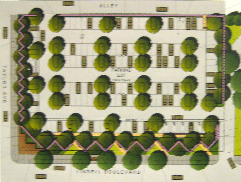
Proposed site plan at Lindell and Taylor

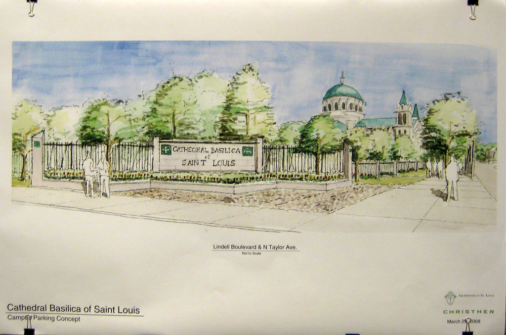
This morning at the CWEA Planning and Development Committee meeting, the architect hired by the Archdiocese of St. Louis explained that the Archdiocese wants to create a "campus" by demolishing the San Luis Apartments at Lindell and Taylor and building a surface parking lot in its place. Yes that's right they used the "C" word! As if that was not bad enough, the next words spewed from the architect's mouth were that the "campus" would make the Archdiocese collection of buildings "not a hodge podge that happened over time"!

WTF! "a hodge podge that happened over time"!!?? uh... most of us call that a CITY! To complete the campus look, for "security" purposes, the surface parking lot would be surrounded by a SLU style black iron fence. So... will they eventually want to fence the Catholic Center, the Cathedral, and Rosati Kain?

Rendering of the proposed surface lot from the corner of Lindell & Taylor

The parking lot would have 150 spaces (although about 20 of these would be lost to a request from the CWEA
Planning and Development Committee request to respect the Lindell building set back line) as compared to 180 spaces that exist in the 3 levels of structured parking in the San Luis building... not exactly a net gain.

The architect pointed out that the existing apartments that were originally hotel rooms are only 240 square feet. If these were combined to create actual one bedroom apartments, with some two bedrooms mixed in, the unit count could reduce from 226 to about 100. If one parking space were allocated to each still relatively small unit, there would be 80 spaces left over for daily use by staff at Rosati Kain.

A representative of Rosati Kain explained their need for additional parking by staff and students. To gain additional parking without demolition, the Archdiocese could put some parking for students on the large grounds of St. Elizabeth Hall, which is directly north of the cathedral across Maryland. To minimize the effects on the grounds, they should use a product called Grasspave2, which uses interlocking plastic rings in real grass to provide the structural capacity to park on the grass. A double loaded row of parking along the Newstead edge of the property could yield about 70 spaces. The combination of this with excess parking at the San Luis would provide more parking than the current demolition proposal.

Grasspave2 product used on each side of a drive aisle

This proposal will need to go before the City's Preservation Board, so it is far from too late to prevent this slap in the face proposal form being executed.

"This Is" for sure going to be in my house someday soon

Decades ago, Miroslav Sasek wrote and illustrated a beautiful children's travel book series called "This Is..." featuring incredible places and the people that live there.


Places like Paris, London, New York, Ireland, San Francisco, Rome and others.


I love framing pages from books. I can't wait to use a few of these in a pretty little grouping in my girl's next room. The colors are amazing, not to mention the subject matter.


Friday, March 28, 2008

Kings of Convenience

From start to finish - this is brilliant.

The moves just might make your night...

Thursday, March 27, 2008

Spring Garden - Urban Style

My mom has such a green thumb. She is always out working in her yard. Every time we visit her I get the itch to start a garden.
Since we live in Boston and are without a yard and soon we'll be moving to New York and won't have a yard there either, I was excited to see these two posts about bringing flowers and plants inside on Another Shade of Gray when I was browsing through her archives.

I love fresh flowers. This sliver vase from Smith & Hawken is so beautiful and is perfect for those single blooms or a small branch of spring blossoms. This particular vase is currently out of stock (besides, it's a little pricey), so I'm on the look out for something similar, elsewhere.
I am really excited about this book. Artificial plants are usually pretty tacky and I am sick of the same old same old house plants. Hopefully this book all about indoor gardening will help me bring the outdoors, in - but in a fresh new way.

Wednesday, March 26, 2008

Kalamkari - The Art of Textile Painting


I am in love. With the amazingly rich textile tradition of India! As I select exquisite fabrics and furnishings for the upcoming bazaar, I can not resist buying double the quantity, so that I can have them at my home too. You can very well imagine what this is doing to my budgeting and thoughtful financial planning!

One such rich textile art that I am planning to get is Kalamkari. Kalam means 'pen' and Kalamkari literally would mean 'Pen craft'. The name is believed to be derived from trade relationships between Persian and Indian merchants as early as the 10th century. Interestingly, European merchants had different names for similar textile art in their geography: the Portugese called it pintado, the Dutch used the name sitz, and the British preferred chintz. Kalamkari today is synonymous with both painted and hand block printed textiles that incorporate natural vegetable/organically derived colors, and the art is primarily practiced in the state of Andhra Pradhesh in India.


Kalamkari in contemporary furnishing...

Beautiful designs from Anupama

Kalamkari bed furnishing found on Overstock


If you would like to try your hand at creating Kalamkari fabric or painting yourself, you can find excellent tutorials here


[History source: Kalamkari Art]

Monday, March 24, 2008

All that color!

I am still recuperating from the mad revelry and color onslaught of Holi - the fun festival that was celebrated in India this weekend. What a weekend it was! With Holi, Easter, Eid Milad and Navroze being celebrated all over the world!

Colored powder called Gulal used to play Holi. Yes, it is smeared on people's faces, hair and everywhere else!


Glimpses of Holi celebrations in old Indian paintings...
Lord Krishna and Radha are popular icons for Holi in Indian mythology
And, Holi spirit and colors captured very well by Steve McCurry
Hope you all had a great weekend too!

Saturday, March 22, 2008

Etsy Art for Kid's Rooms

I love searching for art on etsy. It's affordable and abundant.


Holly (of decor8) wrote an incredible post this week for Real Simple's blog all about her 60 favorite etsy artists for children's rooms or nurseries.

I could easily spend an entire day staring at these images (with my face three inches from my screen). There are so many of these artists I would love to have in my home.

About a year ago I ordered two prints from one of these featured artists, Mandy from Belle and Boo. Mandy was an absolute joy to work with and the prints are beyond beautiful.

"Lost"

"Found"I purchased a large print of "Found" and a smaller print of "Lost", put them in mismatched frames that were painted the same color, and propped the smaller against the larger on a shelf in the girls room. You can sort of see it here below (a pic from my post about my girls' room).

A Little String = Hours of Fun

Some of my most memorable expeiences in elementary school include hopscotch, pogs (sadly), hand-clapping routines, cherry bomb drops from the monkey bars (at least until the time I broke my arm doing it), jumping ropes and especially string tricks.

My favorite was Jacob's Ladder.
I was really excited when I saw this book on Bluelines today.

I would love a copy so Grace and I can learn together. This would be perfect to have on hand for those long, horrible Boston winters when we're stuck indoors with nothing to do.

Throw Pillows

I love these embroidered pillows from Williams-Sonoma Home.


On sale now (although still sort of pricey -- but what did you really expect from WSH?).

The Central West End Deserves Better! Public meeting about the proposal to demolish the San Luis Apartments Saturday March 29

Here is your chance to make a difference! Saturday March 29th the Planning and Design Committee of the Central West End Association will be hosting a public meeting regarding the fate of the San Luis Apartments located on Lindell Boulevard at Taylor. The meeting is at 9:00 am at the Schlafly Branch of the St. Louis Public Library which is located at the northwest corner of Lindell and Euclid
Interior of the San Luis in the in 1975 (from the Globe Democrat Collection)

The owner of the San Luis, The Archdiocese of St. Louis is proposing to demolish the building and replace it with a SURFACE PARKING LOT! This proposal is an insult to everything good happening in the Central West End and the City in general. The CWE is one of the most vibrant, dynamic and walkable urban neighborhoods in the City and one of its most visible blocks is in danger of giving way to the WORST possible use imaginable. Until recently, the San Luis housed over 200 senior citizens, who have since been kicked out and forced to find other living arrangements. The likelihood that these seniors will find comparable housing in such a convenient walkable area are slim.

Is this the future of Lindell & Taylor?

Please come to the meeting next Saturday and voice your opinions. Let the CWEA and the Archdiocese know that the corner of Lindell & Taylor deserves better than looking like its part of a second-rate city with no respect for itself and no aspiration to become a great city and a great place to live. Just one block south and west, the "Doctors Building" parking lot, is about to be replaced with a mid-rise apartment building with ground floor retail. While I am less than thrilled with the design of the new building, at least an eye sore that has been around for 30+ years will be gone. The Archdiocese has given no indication of any desire to build anything new at Lindell & Taylor, so please remember, that if this proposal goes through, we could be faced with a new eye sore for another 25 years or more, so please show up next Saturday.

Thursday, March 20, 2008

Cool Tips from a VERY Cool Photographer

I am a huge fan of photographer Paul Costello's work. I think his pictures are stunning, so you can imagine how excited I was when I saw this post on Decorno, where he shares his insider tips on the best way to photograph interiors.

My favorite tip is to double the exposure your meter suggests. That's how he gets all the rooms in his photos to look so bright.
So if you're like me and you like photography and interior design, then get your geek on here.

Wednesday, March 19, 2008

Magically Unpredictable

Shiva Rae is at it again - creative, innovative, and surrendered - such a wave. Amazing how divine design take it's course when given the cue.

"Being an artist is dragging your innermost feelings out, giving a piece of yourself, no matter in which art form, in which medium." Henry Rollins

True love comes to those who wait; it comes so much faster to those who take a chance. Thus, I don't chase my dreams; I chase my God, the designer my dreams.

Tuesday, March 18, 2008

Contemporary Terracotta

Kumbham, the brain child of Jinan, an NID alumni, has taken terracotta to a new level. And, in the process, also brought about a positive change in the life of potters and artisans from Aruvacode, a tiny hamlet in the state of Kerala. A gradually vanishing community was revived and Kumbham Pottery was born.

Kumbham has an amazing range of sustainable products. Some of the wall murals and tiles are showcased here:


Available at these places in India...