Friday, February 29, 2008

Spring is here...and so is the Feb Bazaar!

Ta da dum di da dum dum da
If there's anything that you want
If there's anything I can do...
Just click on the link...
And the bazaar will send it along
with love from me to you!
'Inspired' by beatles ;-)

Happiness! As spring is almost here. And loads of happiness as An Indian Summer Bazaar just opened again for Feb-March, with a very different collection of hand picked goodies


Click on the images below to go straight to the collection!


India Contemporary


India Traditional


Happy Shopping!

[while I catch up on my sleep! :-)]


Wednesday, February 27, 2008

abcdefghijklmnopqrstuvwxyz

I really love lettering in pretty much any form. I am obsessed with cool fonts and calligraphy and even handwriting.

I'd love to take a calligraphy class someday. This video inspired me to bump it up on my to do list. How cool is his lettering? wow.

via: Hi + Low

Such a cool shot

I loved this photograph posted today on The Satorialist.

It makes me want to live in Paris or Milan so I can take my girls to fashion shows.


Beautiful.

HEARST FORECLOSED 1929 MANSION BOUGHT BY CREDITOR

One of the nation’s priciest residences, Harold Vanderbilt’s Villa di Venezia, the 1929 Italian Renaissance mansion at 1100 South Ocean Boulevard in Manalapan, went on the auction block and was bought by mortgage holder, New Stream Capital, on the steps of the courthouse, for $22-MM. New Stram will put the property back on the market to recoup its investment. The 20,000 sq ft Maurice Fatio home was sold to Randolph Hearst by Mel and Bren Simon for $29.87-MM in 2000, a record sale for Florida at that time. Hearst died 6 months later and his widow, Veronica, was left the house but did not have the money to maintain it. Veronica Hearts paid for property taxes, renovations, etc. by borrowing millions of dollars against the home’ value, selling 150 feet south of the property for $6.2MM.

Quick Peek into the bazaar!

Scheduled to launch in another 2 days, An Indian Summer Bazaar has an unique flavor this time. The bazaar will celebrate metal and wood, under two distinct categories - India Contemporary and India Traditional


India Contemporary will feature the premiere international launch of some great products from Aline Design. India Traditional will feature some antique and some restored products that are earthy and rustic, but have rapidly gained ground as part of urban home decor.

Hope you are as excited about the second month's opening of the bazaar as I am! :-)

Tuesday, February 26, 2008

How to Incorporate the Swedish Style

Many of you have asked how to incorporate the Swedish Style into your own homes. You do not need to have rooms exclusively with one period or style. It is best to mix things up a bit to add interest into your room.
Notice the examples below.


This room has a traditional feel, but notice the Mora Clock and Swedish style bench. Adding a Swedish accent or two really adds to the interest of the room. Also notice the desk chair.
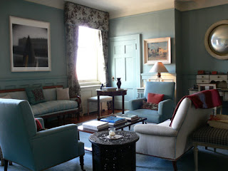
Here is the room from a different angle. Notice the side table - not Swedish -

but it adds interest, doesn't it?


Finally, a sweet, Swedish chair as an accent. Lovely.
I love the symmetry in this room. Notice the antique sofas, bench, and the painted table. Great introduction of the "signature Swedish blue" color.


Here is a room much less formal. The Bellman style chairs lend a "Swedish feel". This room would as appropriate in the mountains as in the city.

Another room with Bellman chairs - I love the checked skirts-
a very Swedish touch!
The Kitchen Designer
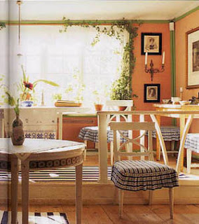
Finally notice the Swedish influence in this kitchen. There are so many white kitchens. In this kitchen they chose a monochromatic palette, Swedish slat back chairs and striped woven rugs. A great look for a beach house.
As you can see adding just a few Swedish elements can give you this wonderful feeling without breaking your budget!
(all pictures, excepted noted, are from Google images, but happy to give more specific credit if they are familiar to anyone)

Monday, February 25, 2008

The Bridges of Highway 40


For this post we venture beyond the City limit to the nearby inner suburbs of Ladue and the western portion of Richmond Heights to view not the loss of a historic building in an urban context, but that of fragments of an aging transportation infrastructure undergoing total replacement. The portion of Highway 40 between Brentwood Boulevard and Spoede Road dates from 1936 to 1946. While it was no Merritt Parkway, many of the bridges constructed along this stretch of highway reflect the streamlined style that was applied to almost anything having to do with movement. The photo above is from a series of old photos available for view on thenewi64.org history page.
This section of roadway was a relic from another era, when cars traveled at a then considered speedy 45-50 mph. It was built with an almost parkway like feel, with two lanes each direction separated by a grassy median. This parkway like feel was, and still is to this day augmented by the fact that it bisects a community that by choice has preserved an almost rural feel by shunning office parks, mega-strip malls, and cookie cutter subdivisions that fill much of the modern suburban landscape.

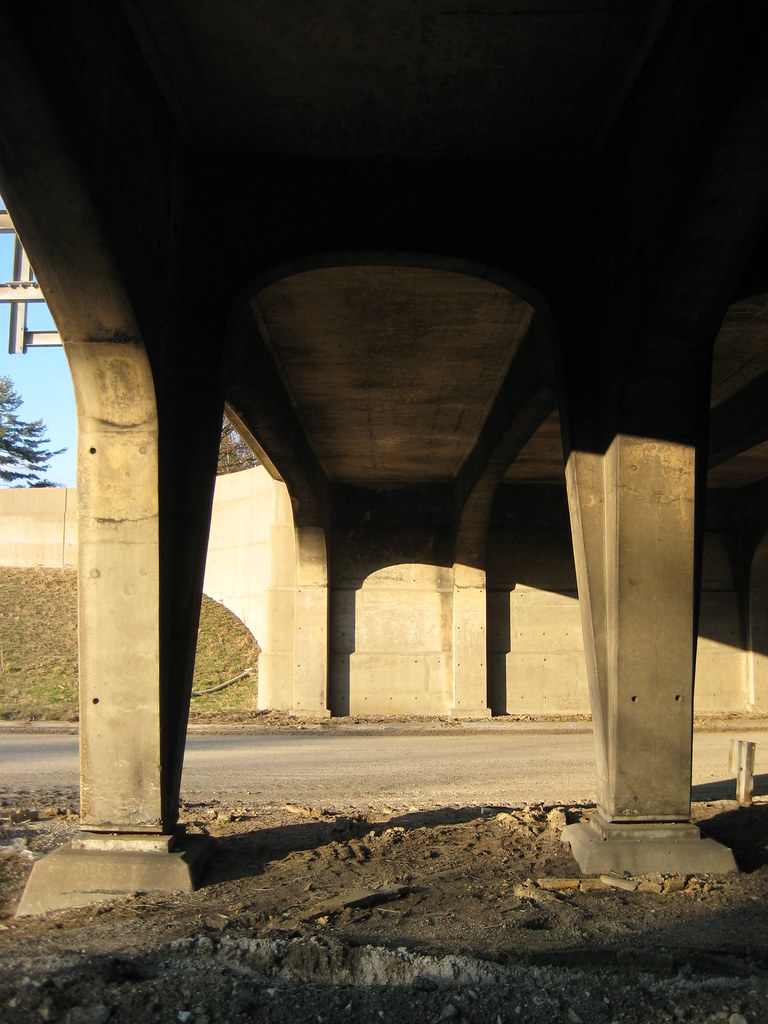
Without a doubt the most interesting surviving structures were the overpasses at McKnight and McCutcheon. The McKnight bridge was a wonderful expression of streamlined modern with its curving stepped embankments.
The bridge at McCutcheon was a bit more fanciful with the lines of its embankments fanning out from the earth. There are more art deco influences in this bridge with its decorative pilasters flanking the span and a medallion at the graceful center columns.
Photographing the bridges was an almost surreal experience. For the first time in my life, I was walking down the middle of the highway! The bridges that I had known and appreciated since I was a child growing up nearby could now be fully enjoyed at a pace a bit slower than 70 mph. Details that I had never been able to see but for a nano second such as the gracefulness of the arches running perpendicular between the center columns or the way the lines of the embankments at McKnight continued through under the spans could now be captured.
I was not alone in my fascination. On a sunny but very chilly Sunday in mid-January there were several people out. Some like me were taking photographs, while others were simply out running or walking the dog. It was as if people had taken over the former highway as a a new recreation area or a linear park.
Location marker cast into each end of the overpass span at the median

A concrete sculpture commemorating the trans-Atlantic flight of Charles Lindbergh once graced the bridge over Lindbergh Boulevard. It was destroyed many years ago when the median in this section was filled with pavement. (photo from thenewi64.org)

The temporary loss of a highway
that played a major role in the decentralization of the City of St. Louis is certainly nothing to mourn, in fact my prediction that the ridiculously over hyped closure would be a non-event instead of the predicted doomsday have come to fruition. The fact that people have easily adjusted, and a large percentage have switched to nearby surface roads as opposed to heading to 70 or 44 leads me to believe that Steve Patterson's concept of replacing 40 with a boulevard including mass transit instead of an over-engineered high speed freeway might have actually been feasible. What is worth mourning is the loss of structures designed with a human hand from an era when good design was a standard feature of public infrastructure. The replacement bridges will be basic utilitarian structures. Today MoDot's idea of "good design" is some black iron fencing and some cutsie neo-historic lamp posts (click here to see a really lame rendering from their web site). More photos can be seen here on Flickr.

The Beauty of the Mora Clock


Lovely Painted Mora Clocks


Set from the movie "Something's Gotta Give" - note Mora clock on side wall


Stripped and waxed Mora clock. Though not as valuable as an original painted clock surely as beautiful. Notice the lovely carving. So much personality!!!

The History:
The Mora clock is a staple in the Swedish design. Mora clocks are a type of long case clock which were made in, and derived their name from, the town of Mora in Dalarna province, Sweden. The Swedish Mora clock first appeared in Stockholm during the Rococo Period in the mid-eighteenth century. Bad weather and poor soil forced the farmers in the Mora area to look for ways to supplement their income. The villagers of Östnor, outside Mora, turned to a traditional home craft, the making of clocks. Each family specialized in a specific part: some made the brass clockworks, some painted the faces, while others built or painted the cases. At the height of production more than 90 families were engaged in the trade, and Mora functioned as one large clock factory. More than 1000 clocks, named for their place of origin, were produced each year and were sold throughout Scandinavia. Within 80 years, competition from Europe and America brought an end to this communal enterprise, but the curvilinear shape of the classic Mora clock is still sought after today. For more information go to http://www.cupboardsandroses.com/


The Mora clock has been growing in popularity over the past several years in the US. You'll see the Mora clock in feature film sets, (Somethings Gotta Give) on the covers of popular home decorating magazines (Veranda March/April 08) and also being copied (albeit poorly) by reproduction furniture makers. Their growing popularity has driven the price up as supply for these original clocks diminishes. The gentle curves lend a warmth and beauty to the rooms they are in! Notice the carving on the bottom Mora clock - so amazing! Handmade, each have with their own unique, whimsical charm. You can't help but smile when you see one. Wouldn't you love one in every room?

Sunday, February 24, 2008

the only way out is within

Waters were finally calm today, celebrating the bday on lovely Lake Austin, what a treat. One action encourages the other, heals, detoxifies and electrifies the body and mind at their deepest levels.

Miniature paintings in a new avtaar

Olaf Van Cleef describes himself as a traveller, an artist and an author. He is the scion of Van Cleef dynasty and is a counselor on high range jewellery at Cartier since 1982. Olaf first visited India, to present the Cartiers of Paris as a group that cherished its Indian connection and the Indian heritage, and was so enthralled by this culturally rich vivacious country that he returned to the sub-continent time and again ... and again...
For, Olaf Van Cleef was seeking sustenance for his personal philosophy of oneness with the fellowmen and discovered, in India, decisive faith: that in the rich cultural soul of this country he would find the wherewithal to satisfy his soul.

Presenting some of his paintings inspired by India and the art of miniature paintings below. Mythology and Indian iconography have been beautifully portrayed by Olaf using his style of painting using abstract pointillism and tachisme


More of Olaf 's work in mosaics can be found here

Saturday, February 23, 2008

Lee Industries

I still love my Lee Industries sofa today as much as when I bought at Crate & Barrel two years ago. It's given me a strong appreciation for well-constructed furniture.
I felt pretty fancy when I saw that Sofia has the same sofa (different color) in her Soho loft.


Their furniture is classic-yet-contemporary and comes in every possible fabric choice you could imagine. Here are a few of my faves from their website. I could easily furnish my entire house with their beautiful stuff.

For the living areas


For the Den
For the dining table
For the Bedroom
For the Nursery


(this chair is junior-sized - I'll take two, please.)