Well, we are here! The end of a very interesting year, historically, politically and spiritually!
I do not make New Year’s resolutions. Why? It’s like trying to buy a gift for someone who already has everything. In my case, I make lists all the time, so why do another one just because it’s January 1st?
So, instead, because my blog is focused on interior design, I thought I would post some spaces that were inspirational to me, that lifted me up, that made me think about the way that I wanted to design, that made me want to be a better designer, that made me want to have access to better workrooms and carpenters and skilled craftsmen. These spaces spoke to me.

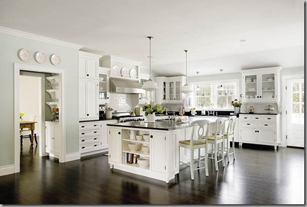
I saw this kitchen on Ronda Carman’s All The Best Blog and instantly wanted to be sitting in this space on a warm, breezy summer afternoon with the french doors wide open. It also helps that the space it all white, which I love.
This kitchen was modeled after the movie “Something’s Gotta Give”. It’s my dream kitchen and I longingly look at this picture every once in awhile and hope that one day I will be able to buy a house where I can have this kitchen! I love everything about it from the wall color, to the bin pulls to the dark hardwood floors.
Well, it’s obvious why I like this space….. the view! I’m not sure where this living room is located. I do know that it was designed by Randolph Duke. And, I love the brick that extends past the wall of glass to the exterior, that leads your eye to the view. The furnishings are all kept monotone, so not to distract your eye from the view. Fabulous! And how about that fireplace!
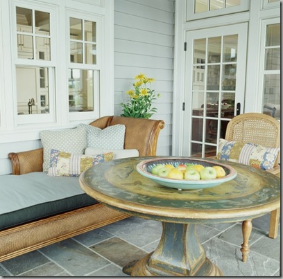
This patio setting with a wonderfully distressed painted pedestal table and beautifully styled patio furniture just makes my heart happy. Not your typical patio furniture and that’s what I love about it!
Windsor Smith Design. I love the big wing-back chair at this table and the pendant lights mixed with the Chinese inspired chairs. I can just imagine cooking for all of my friends who would be hanging out right next to me at the table and chatting.

Windsor Smith Design.
I love the kitchen above for the Chinese-Chippendale chairs. And the fact that they used red chairs in this kitchen makes me love it even more. It’s hard to see in the picture, but there is a red lantern above the table in the second kitchen.

No Design Inspiration blog would be complete for me without my favorite designer, Michael S. Smith. This is the Painted Room that he did for the Lowell Hotel in New York. It’s so calm and serene.

Another relaxing bedroom by Tamara Magel.
A friend of mine introduced me to Jeff Shelton, an architect in the Santa Barbara area who builds really funky and really fun architecture. I love this space because the windows are so fantastic and organic. This building could be in a Dr. Suess movie!

Hamilton Design Associates, New York. I love the use of blues and greens in this space. It’s a bold mix of pattern and color and not for the faint of heart.

One more from Hamilton Design Associates. Here they use tangerine and light green in various patterns to create a fresh room that my daughter would love. It uses a fresh energetic color, but somehow this room feels restful to me.

Bob Barry Design of Los Angeles. Even though sparsely decorated, the stone and personal effects (look at all of those photos on the upper landing!) give it a warmth that I love.

Elegant, refined, airy and unconventional with the cowhide. Charme Tate Interiors out of New Orleans gives us this beautiful room.
HAPPY NEW YEAR!!!!! May your heart be filled with Love and may Blessings come your way in 2009!!


0 comments:
Post a Comment