I am researching commercial design have come across some incredible restaurant, office and retail business designs. Here are a few that are absolutely beautiful, interesting and memorable.
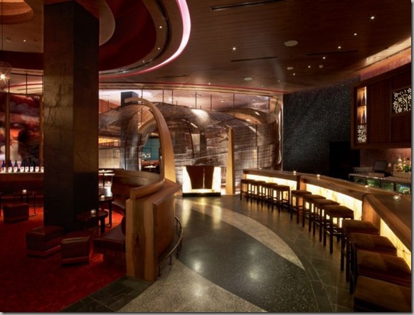
Nobu has opened their first restaurant in the Middle East. The restaurant is located in Dubai’s Atlantis Resort on Palm Jumeirah, and was designed by the Rockwell Group. Palm Jumeirah is the celebrated man-made island in the shape of a palm tree in the Persian Gulf, with world class residences, hotels, retail and entertainment.
For the lounge, Rockwell Group developed curved translucent flower panels.
Nobu Dubai was an evolution of many of the concepts Rockwell Group developed for the flagship Nobu Fifty Seven in New York, such as the emphasis on craftsmanship, natural materials and storytelling. The textures and materials in this particular location were chosen to reflect the finely crafted cuisine and Nobu’s roots in the Japanese countryside, while also celebrating the Dubai beachfront context.
Nobuyuki "Nobu" Matsuhisa born 1949 in Saitama, Japan, is an international celebrity chef and restaurateur. Nobu is known for his fusion cuisine which blends traditional Japanese dishes with South American (Peruvian and Argentine) ingredients.
Nobu is the co-owner (along with Robert De Niro and managing partner Richie Notar) and the executive chef of Nobu New York in TriBeCa, New York City. The success of Nobu New York spawned several similarly themed restaurants in Aspen, Athens, Beverley Hills, Dallas, Hong Kong, Honolulu, Las Vegas, London, Los Angeles, Malibu, Melbourne, Phoenix, Milan, Mykonos, San Diego, The Bahamas, Tokyo and soon Cape Town. *
Translucent flower panels line the walls outside of the wine room.
The sushi bar has 12 seats. The flooring here is black bamboo-embedded terrazzo.
A private dining area.
The restaurant’s walls and ceiling are encased in large hand-woven curvilinear abaca panels to evoke an environment submerged under an ocean wave.
A private dining room seats 24; the walls are decorated with glowing sake bottles.
In Santiago, Chile, the 38 years old Los Heroes Building has been renovated into a very modern office building that will turn heads when walking by.
The Los Heroes Building before the renovation.
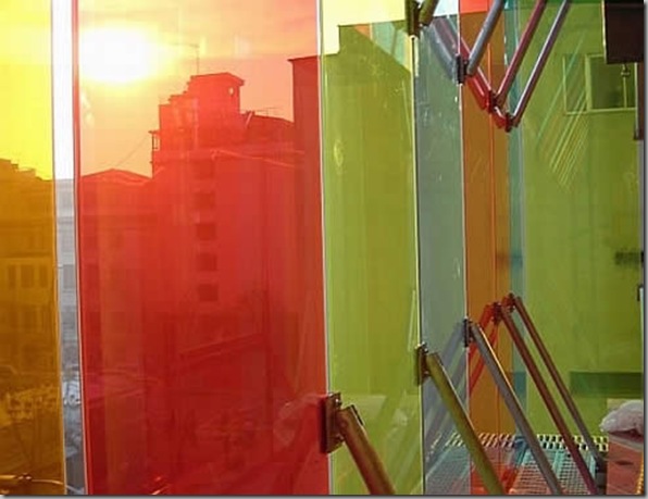
Murtinho Y Asociados Arquitectos have been in charge with the change and their challenge was the rehabilitation of a ‘70s building for a new purpose: The General Offices of Caja de Compensación Los Heroes.
To create and transform the old and grey `70s building into a new one expressing character, they used the relationship of “leisure – nature” as the main architectural concept.
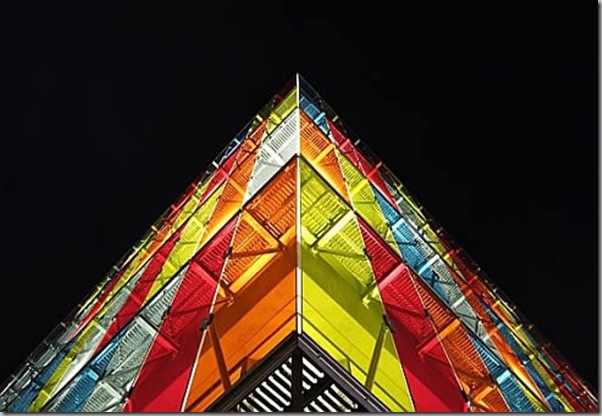
The façade skin celebrates the relationship between the institution and its urban context, or in other words, between the building and its “urban nature”.
At the same time, the building strategy is to efficiently collect energy with a sustainable façade. The double façade skin is an UV ray filter.
And finally, my favorite….
Named Swarovski Ginza (nicknamed Crystal Forest), this Japanese store has been designed in collaboration with Swarovski and famous Japanese designer Tokujin Yashioka. As the key element of the shop, the facade is covered with nearly 1500 stainless-steel mirror relieves.
The exterior is covered in stainless-steel pieces reflecting fragmented views of the street.
The walls of this store are textured with reflective white relief prisms of various lengths.
The crystal stairs are magnificent. The crystals are embedded in the floor, but I would almost be afraid to wear my shoes in this store, for fear of getting the floor dirty!
The crystal waterfall on the right runs from the second floor to the first.
The crystal stairs and waterfall make for a brilliant shopping experience (pun intended!).
* Sourced from wikipedia.org


0 comments:
Post a Comment