A sincere "Thank You!" to the Washington Post for including this post in your Blog Watch, July 24th, 2008!
In my quest to revamp my kitchen and pantry, I have studied countless Christopher Peacock Kitchens for inspiration. Because Christopher Peacock limits images which can be copied I was able to locate some of his work via Real Estate listings in Hampton, NY and Greenwich, CT. All the pictures below are from real estate listings which noted that the kitchen was designed by Christopher Peacock.
In my quest to revamp my kitchen and pantry, I have studied countless Christopher Peacock Kitchens for inspiration. Because Christopher Peacock limits images which can be copied I was able to locate some of his work via Real Estate listings in Hampton, NY and Greenwich, CT. All the pictures below are from real estate listings which noted that the kitchen was designed by Christopher Peacock.
The signature Peacock White Scullery Kitchen. Counters are carrera marble with a white subway backsplash. Notice the pot filler behind the stove and high arc faucets. The pendant lights are usually hung in twos or threes. These lights are from Circa.

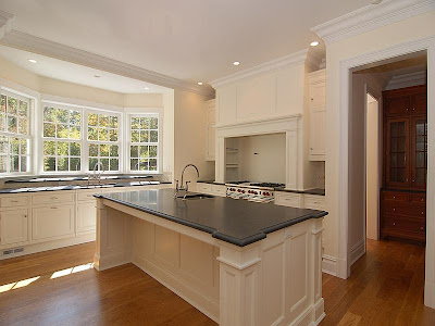
Another signature Peacock white kitchen. Cabinetry is inset and counters are soapstone. This kitchen also has High arc faucets and pot filler. Note that the stove hood design is similar. Also notice the notched corners on the island, both are signature Peacock styles. One interesting feature of this particular kitchen is the sink in the center island. I read an article where Peacock mentioned he does not generally prefer to have a sink in this location. He said he liked the center island sleek and unobstructed.
Another carrera marble kitchen. I love the darker wood floors with these cabinets, versus the lighter floors above. Notice the faucets are also high arc and brushed stainless. These particular faucets are KWC Systema style, very pricey. Also notice the ice box style hinges and latches on the doors. This kitchen has inset stainless steel drawers. I am not a fan of these, as a mother of two, I just could not keep them fingerprint free.
Here is a lovely Peacock kitchen in the Hampton's. These floors are not wood, but a lovely slate - very pretty. I love the butcher block and marble island. Notice the glass front subzero refrigerator. I love the color of this kitchen and the multiple surfaces; marble, soapstone, slate and wood.

These two pictures are from a Peacock kitchen that is in a new spec home in Greenwich. The floors are amazing! Notice the marble and soapstone counters; and classic bin pulls and latches on the cabinets. I like how you can see the microwave in the bottom right photo, but when you enter the kitchen it is hidden on the side by the refrigerator. Inset cabinetry, pot filler, subway tile - seeing some trends?
Here is a different style Peacock kitchen. This is from an older home. I think probably a kitchen done by Peacock before his White Scullery Kitchen got so popular. Notice the heavier mouldings on the door and corbels. Notice the apron front sink, classic white school house pendant lights and large wood cabinet knobs. I am not a huge fan of the green hood though.
Here is another one from the Hampton's. I love the warmth of this kitchen. Although a white kitchen, it does not have the starkness of some the others. The backsplash behind the stove is lovely. It is small marble bricks with an inset arch; nice touch. The ceiling and the fixtures lend a more rustic feel.
This kitchen is obviously more formal. I love the X cabinetry. Pendant lights, ice box latches, bin pulls, marble and soapstone complete the look. Another notched corner island with a rectangular sink.
Here is the final kitchen from the real estate listings, notice the backsplash behind the stove. Here they use a solid piece of marble - you really get to see the veining in the stone. Also note the center island with sink and wood top. Perhaps clients do not always agree that a center island should be unobstructed.
0 comments:
Post a Comment