Showing posts with label Beadboard. Show all posts

Wednesday, April 14, 2010

Blue Ceiling Beach Cottage

My friend and wonderful photographer, Jamie Salomon of Salomon Photography, recently sent me photos of this beautiful beach cottage in Maine. The home is the spectacular retreat of designer, Francine O'Donnell
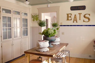
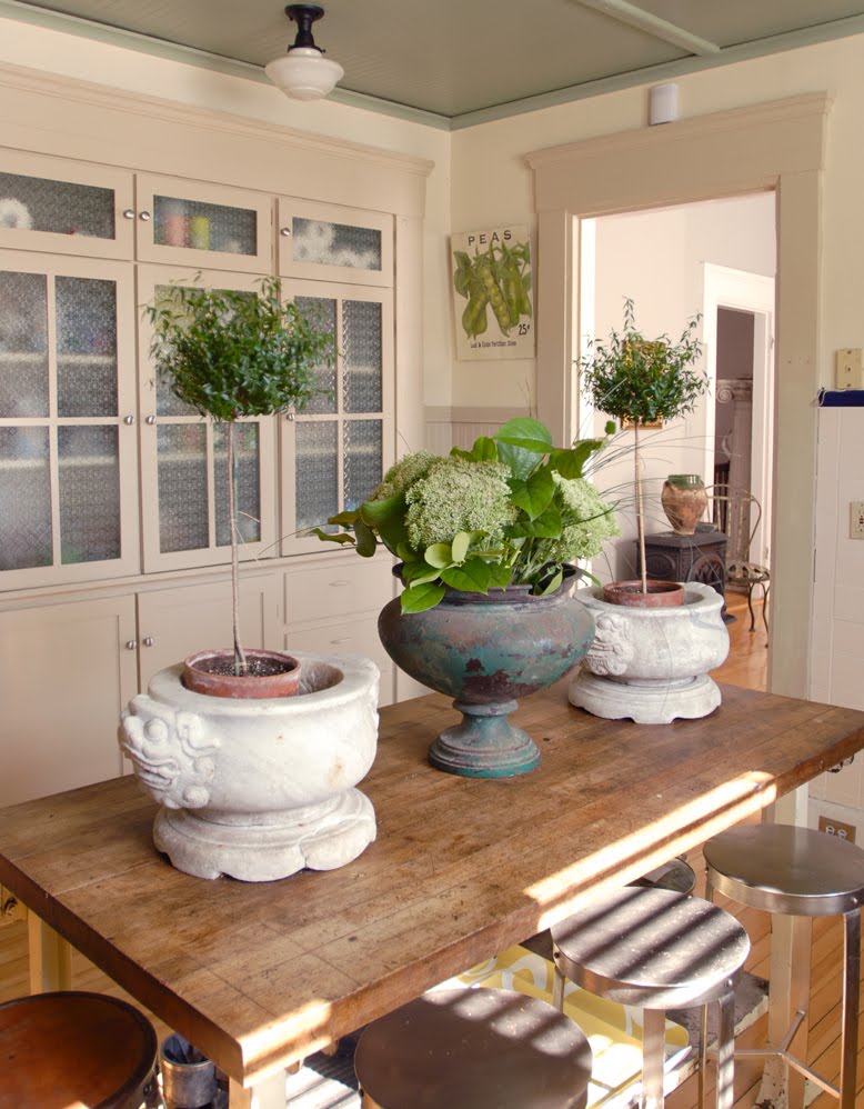
The home has a traditional beach house decor with a bit of whimsy. I love the stools and the center island. What is most striking to me is the color palette. Take a look at this kitchen - taupe/beige cabinets and trim with creamy walls, but the most interesting is the soft blue ceiling. An area often overlooked - so let's have a closer look ceilings in this beach cottage.
Here is the kitchen from another angle. The ceiling color is much paler in this shot. This is a common occurrence when you use pale colors, in some lights the color actually washes out. With ceilings my preference is always to go on the paler side. I like to feel the color with out getting overwhelmed by it.
Here is a closer shot of the same space and you can see the blue ceiling more strongly. I love the whimsical signs - this particular sign adds such personality to the kitchen. Vintage style light fixtures and pale floors also add to the ambiance.
Moving to the family room we again see the use of blue on the ceilings. Notice how the color does not make the ceiling seem lower, but actually makes the ceiling almost disappear.
The same room from a different angle. You can see the patch of blue (like the sky) in the top left side of the photo. Again the SEA letters, life ring and assorted wood signs add a happy lightness to the room. I adore the beadboard walls. Also notice the slanted wall area - often times it is painted to match the ceiling - in this case it would have been a mistake. Keeping it white allows your eye to travel up and adds a feeling of openness to the space.
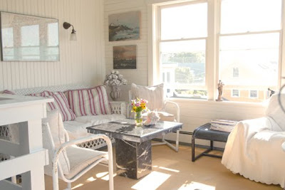
Here is the Family Room again from another angle. I love the slouchy softness of the big throw covering the chair. This a room where you can really kick back and relax.
The upstairs hallway continues with blue ceilings. Also notice the gray/blue painted floors. I love the doors - clearly they are original to the house.
A peek into the bath - which seems to have white ceilings but wonderful sea glass green walls. More of this beautiful home to come next time!!
.
But for now just a quick tour of a great beach cottage which was enhanced by painting a space often overlooked - the ceiling. Have any of you taken on the ceiling??
(all photos Salomon Photography not to be copied with out permission)

Monday, March 1, 2010

Beauty on the Rocky Coast

As you know I am a fan of the northern New England coast. Though the water is always cold and the coast rocky, with few soft sandy areas, I love the contrast of ocean and craggy coast line. This house, redesigned by Whitten Architects is a perfect example. The house began as 1950's ranch, but was renovated into a spectacular ocean front home. The owners requested that they keep the feel of old beach house. The screen porch above captures the feeling with the beadboard ceiling and wicker furniture.
Here is another porch - I love the rockers and granite steps - this is classic coastal Maine.

The owners are empty nesters, but wanted the home to have lots of seating and bedrooms for guests. I love the choices of slipcovers in this room. Also notice the sisal rug. They mixed in some antique tables and accessories which give the room wonderful, warm feeling. Notice the antique weathervane arrow and the black and white framed photos lining the walls.
They were able to find and incorporate an antique mantel in the family room. Doesn't it just make the room?! Again more black and white photos - this is an easy and inexpensive decorating touch that can a classic feeling to your decor. Antique Pond boat on mantel is a classic addition.
Above is the kitchen, notice the cabinets are mixed with an antique painted cupboard. You can see the loft above from a different angle.
A four poster bed is the one of the highlights of the master bedroom, but the view is the real highlight. Sheer curtains, frame rather hid the spectacular view.
Built in beds make the most of the sloping ceilings. A fabulous retreat for the younger set. For more photos of built in beds click here.
'
Check back this week for photos of my finished dining room and another new project ...
'
(all photos Whitten Architects - photo credit Brian Vanden Brink)

Monday, February 22, 2010

Getting Reacquainted

I love to find designers who have a look and style that is fresh and fun, but also traditional. Designers who have a coastal look that is so wonderful and leaves you wanting more. So I was thrilled to be reacquainted with the work of Molly Frey from Marblehead, Massachusetts via House of Turquoise. (if you have a moment do go over and see all Erin's wonderful posts - I never miss one!!) I say reacquainted because I had also seen Molly Frey's work via Bandelle and had put that wonderful post in my saved file in the summer. When I went to Molly Frey's website I was reminded once again how much I admire her work. I have saved clippings from many of her rooms which have appeared in Traditional Home, Better Homes and Gardens, Renovation Style and New England Home.
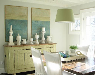
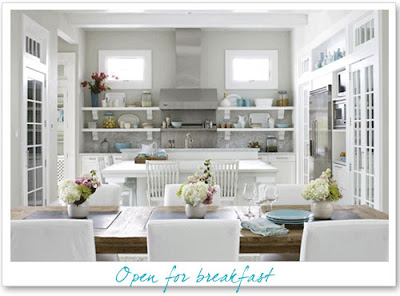
She has a wonderful coastal style. Fresh and clean. She also writes a blog! Do take the time to see of more of her beautiful rooms. She has an incredible talent -and it's wonderful escape from these cold New England winters.
'

And don't forget to spend some with Erin at House of Turquoise!


'
(all photos: Traditional Home (photographs by Michael Partenio) & Molly Frey Design)

Thursday, February 18, 2010

My Breakfast Room and Family Room Reveal

When I bought my house I knew we would need to enlarge the kitchen and family room area. The previous owners were empty nesters and although the layout worked for them, it was not appropriate for our growing family.

This before picture was taken during our home inspection. At this point the previous owners had removed much of their family room furniture - all that remained was their small kitchen table and some odd chairs. You can see that the wall of windows was about 3 feet beyond the solid wall. A larger table would have ended up looming into the Family room space. So, when we were ready to renovate we pushed back the wall and added an additional nine feet to create a dedicated breakfast room. Here is the breakfast room after!

We recessed the ceiling and added beadboard and crown moulding to match the treatment we added in the kitchen.
I vacillated for months over the light fixture, but finally decided on the Niermann Weeks Italian Chandelier with an antiqued silvered finish. (Actually I vacillated over spending the money or not spending the money - I always knew it was just perfect) In the end, it was my husband's sage advice that made me order it - "You will look at this everyday, all day, for years - buy what you love!" I am so glad I listened to him (He says its one of the only times!)
Here you can see that we added three windows on each side to keep the original feeling.

I found a wonderful Belgian wrought iron table with old wood top that fit the space perfectly. Wisteria had a bench that was just the right size and I topped it with a grainsack! The linen curtains were a steal, only $20. a panel, a close-out from Country Curtains; all they needed was a little doctoring.
You might remember that at this time I also took out the over head cabinets between the Family Room and Kitchen area and removed four lower cabinets to create more of a center island.
Here you can see how much better the space feels. Removing the upper cabinets also allowed you to see the recessed ceiling area in the kitchen. We spiffed that up a bit by adding the beadboard and crown moulding details.
Here is the Family Room before. This is directly across from the center island. The size is deceiving as the back wall is over 13 feet wide.
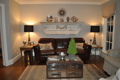
Here is the Family Room after. We added the window on the right to match the rest of the back. It was a great addition as it brings in so much light to what used to be a shadowy area. The mantel above the couch I found in the trash on the side of a road many years ago. It has an original workman's label from 1881. What a find!! I just love the feeling it brings to the space. Lamps are from Aidan Gray and the mirror is from Wisteria - It came in gold so I silver leafed it one afternoon.
Here is the before looking from the Kitchen area out toward the Family Room area. Notice the wonderful ceiling detail that was hidden from view before we removed the upper bank of cabinets.
And here is another photo of the after. Notice the addition of the crown moulding. The chairs are my old yellow club chairs, slipcovered in the same close-out linen from Country Curtains- a steal at $6 yard. I think they are bit oversized, but until I find what I am looking for they were an inexpensive fix. Here is the TV cabinet - notice the size of the TV that fit in it.

We added a gas fireplace, mantel and surrounded the area with crown moulding. We also placed a much larger TV above. Winter is long here so the fireplace makes the space so much more cozy.

This is the full view of the new space if you are standing in front of the fireplace.

From this...

To this...
(click to enlarge)

A final thought - I have received some email recently about rooms done by decorators that are considered "high-end" and not accessible to the average person. I just want to share with you that not all things that look expensive actually are expensive. Beauty does not have a price tag. Do not be afraid to mix $20 curtains and mantels you find in the trash with expensive chandeliers, or reproductions from mail order catalogs with real antiques. Trust what you love and it will all come together. It's not about the price, it's about surrounding yourself with things you enjoy.

We really enjoy our new space - I hope you do too!!
To see more of my house click here.
(all photos Willow Decor please do not copy without permission)

Wednesday, January 27, 2010

Beach House Renovation with a Twist

It's always exciting to hear from my readers! Last week one of my readers contacted me and let me know about Michael Greenberg Associates in Connecticut. He owns a wonderful architectural firm which also has a beautiful cabinetry arm. My reader's husband used to work for them and she knew I would love their work. She was so right!
This is a stunning old beach house renovation in Connecticut done by Greenberg.
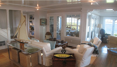
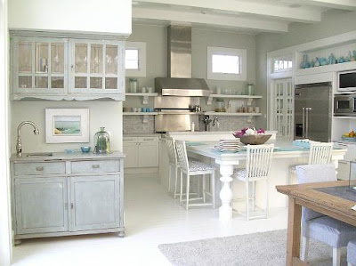
I love the openness of this home, but I also like how they kept the old feeling by making sure they used similar, substantial mouldings. A lovely mix of slipcovers, sisal, rattan and glass! All give it a beach house vibe, with class.
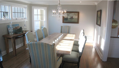
The dining room is rather sparse, but it really goes with the New England Beach look. I like striped fabric on the upholstered end chairs and the solid fabric on the side chairs. Traditional with a twist.
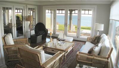
The sunroom really captures the spectacular outdoor views. I like how the furniture echos the grid lines on the windows. The subtle furnishings blend, as they should, and do not compete with the view.
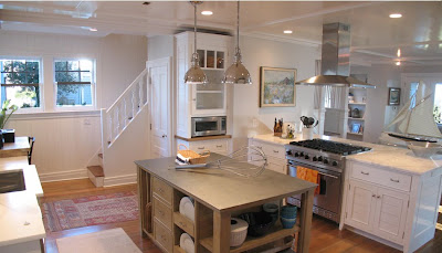
Here is another view of the kitchen. Traditional New England Beach House style with white marble counters. Very Christopher Peacock! I like the center island - not sure what the top material is - Corian? The big whisk is fun! I actually have one that I picked up yeas ago at a flea market, but mine is in a box in my basement waiting for the right photo shoot!
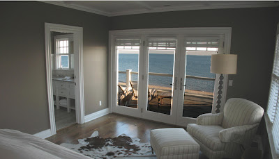
I love the color of the Master bedroom! Notice the cowhide rug on the floor - we are seeing these everywhere now! To read an previous post about cowhide rugs click here
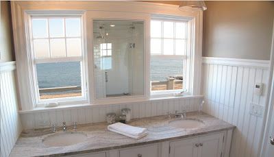
Lovely master bath - The window placement and the mirror is interesting. I have a similar set up in my own master bath. I also love the textural element of the beadboard.
Finally the wonderful outdoor screened porch. It really is a room of its own with the fieldstone fireplace.
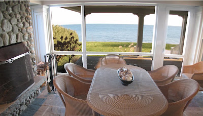
What a spectacular view!

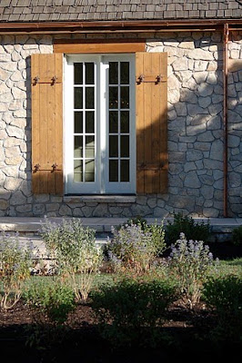
My reader and her husband relocated to Utah and he just completed another gorgeous home. The workmanship and detail are amazing! Here's a sneak peek of part of the exterior. I will be posting the rest the home later this week! See you then!

(all photos m.greenberg assoiciates)

Thursday, January 21, 2010

Belgian Factory Restored

Some of my favorite magazines are from France and Belgium. I recently saw this wonderful Brussels home that was originally a mirror factory and wanted to share it with you.
The owner, an artist, has lovingly restored and refurbished the factory over the course of several years. The dining room above features a naturally worn farm table and a collection of antique cream chairs with a wonderful patina. The cupboard is made from several old pieces of wood and houses only part of the owners extensive glass collection. The large entry is painted a beautiful buttery cream while the ceilings and upper mouldings are painted a contrasting white. The doors and built in mirrors add to the already light filled space. An antique woodworker's table is a beautiful place to display the owners collection of vintage hats. The light fixture is from IKEA. The kitchen is so wonderfully rustic. Old library shelving is painted white and used to display the huge collection of dishes and serving pieces. An antique library ladder is used to retrieve those items too high to reach. Notice the thickness of the shelves; thicker shelves were created to handle the weight of the different types of crockery. I love the interesting contrast of the industrial style faucet. The owners extensive glass collection is housed in an antique museum case that was painted a soft white to match the walls and highlight the glass. A collection of old unmatched chairs were also painted in soft pastels which unify them. The soft colors and leaning antique mirror add to airiness of the room. Interestingly the light fixture, which matches the entry fixture is also from IKEA.
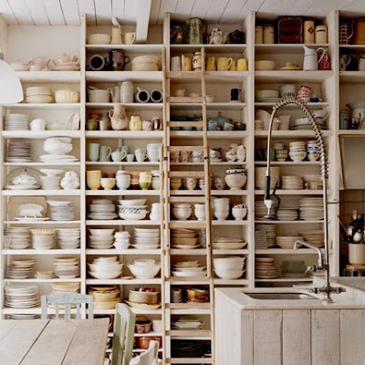
The library, which doubles as the owners studio is washed in gray paint. The library shelving was also painted and holds the owners extensive collection of books. A vintage stepladder makes the high shelves accessible. I love the wide pine floors, softened from years of use left natural and waxed. The light in this room is just fabulous.
One of several bedrooms -I included this room because I adore the wall moulding.
Here is the adjacent bath. I like the mix of pieces in this space. The antique painted table looks so interesting with the reproduction tub.
This is the trompe-l'oeil bedroom. A closer look reveals a wall of canvas painted by the owner to look like pillows and headboard. A vintage industrial metal stool serves as night stand.
Finally another bath - I just adore the way the owner painted/washed the wall in a soft green. An antique cupboard holds extra towels and sundries for guests.

For more information about this wonderful factory turned home in Brussels click here.

.
(all photos marieclairemaison)