I am always intrigued by spaces that were artist studios and have become living spaces or the other way around. Perhaps it's knowing that someone put their heart and soul into creating there or would be trying to create beauty makes the space very romantic to me. I was sent this wonderful little house that was formerly an artist studio and the new owners turned it into a guest cottage.
We are not strangers to peeking inside of artist studios on the blogs. You surely will recognized this gorgeous pool house turned artist studio created by Brooke and Steve Giannetti. Read all about this incredible space here.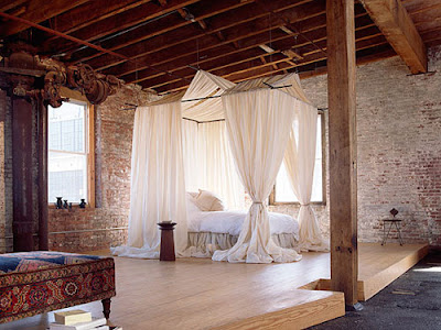
Or this urban loft and artist studio I wrote about last year designed by Ochs Design. Read about this fabulous space here.
 Named "Openview", because of its spectacular views of the English countryside, this artist studio turned guest cottage is located just outside of London.
  Upon entering you immediately notice the open, airy style and wonderful light. Both indicative of why it was a great artist studio to begin with.
 The furnishings are warm and inviting. Danish white soaped floorboards add a wonderful patina and ambiance to the entire space. Notice how a wicker trunk becomes a coffee table and a stack of book a side table. I love the mirror leaning to the right.
 Cathedral ceilings and sheer white linen curtains create a dreamy environment. I love the small desk and collection of framed pressed flowers. The folding bistro chair is wonderful. Clearly there is space to still paint here.
 Here is a closer look of the living area. Notice the old worn chairs that do not match and floral couch. Everything is broken in and muted. It makes you feel like you can sit right down and relax.
 In the dining/kitchen area an old church bench is painted white and paired with an old farm table and bench. White paint unifies the non matching collection. You can see how the painted concrete floors tie in seamlessly with the outdoor antique brick patio. I love the series of prints hung behind the bench.
 Opposite the table is the kitchen area. Enameled appliances, open shelving and old fashion linen skirting continue the cottage charm.
 Here is a closer view. Notice the apron front sink, a must in any cottage kitchen.
 We end with a soak in the tub in a dreamy bathroom. I love the multiple mirrors. This is a simple and inexpensive decorating idea to add drama to a space. I think the owners did a great job of keeping the charm and creating a comfortable house for their guests.
.
Don't forget to subscribe to Willow Decor in the upper right corner! Have a great weekend!
.
(all photos beach studios to see more of this cottage click here) 


 Here is the breakfast room after!




 We added a gas


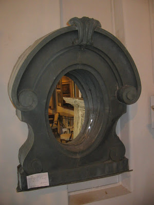
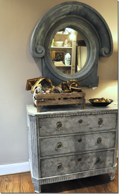
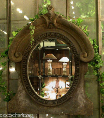 I wanted to hang one outside in my garden as a lovely focal point. But, at that time I lived in a small apartment with no garden, so the Oeil de Boeuf was not meant to be.




 Earlier in the week I promised you a tour of a wonderful newly constructed house in Utah. Built by a reader of WD and her husband (who previously worked for Christopher Peacock Kitchens). The house is an wonderful example of true craftsmanship.
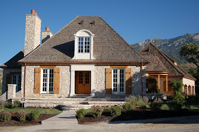 We were able to get a private sneak peak into this home which they refer to as the "French House". The home is currently for sale, and unfurnished.
 The main entry, though not grand in size is really beautiful. Notice the key details here: herringbone floors, hand forged iron railings, exquisite moulding details and a beamed ceiling. Beyond we see an interesting curved hallway.
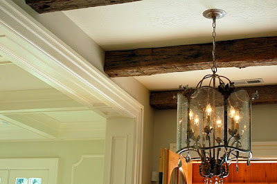 Here is a close up of the reclaimed hand hewn barn beams
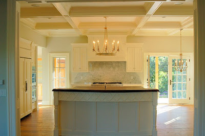 Of course when the builder is also a world class cabinet maker you know the kitchen will be the jewel of the home and this one is gorgeous! It has a very Christopher Peacock feel, but I think this particular kitchen has even more personality. I love the front X detailing on the center island. Also notice the coffered ceiling. I also like the choice of light fixtures!
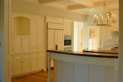 Notice the the first center island has a soft curve to it, which was harder to see in the picture above. Having a conversation at a curved island versus a straight one is much more enjoyable. You should always try to incorporate even a soft curve in a kitchen island if possible.
 I love the subtle diamond shaped marble tile backsplash. As expected the kitchen is outfitted with top of the line appliances.
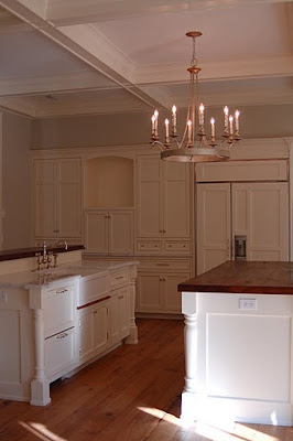 The first island has been thoughtfully designed with a step down so guests can't view a messy sink. The second island is topped walnut for food prep.
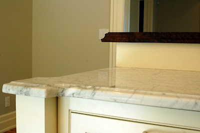 Here is a close up of the corner detailing on the island! Wonderful!
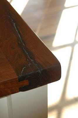 A close up of the walnut top - notice its tongue in groove and bread board sides.
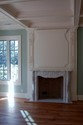 Coffered ceilings continue in the Living room, which also has a stunning fireplace and surround. Can you imagine how wonderful this home would look furnished?
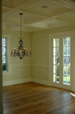 The dining room with French doors and interesting moulding details
 The family room continues the coffered ceilings. I love the fireplace! My imagination is going wild furnishing it in my head!
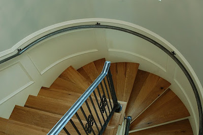 The curved staircase is just stunning - hand forged iron railings are beautiful.
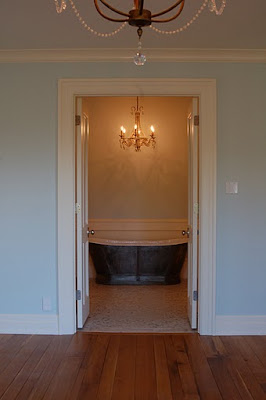 A quick peek into the master bath which reveals a coveted zinc soaking tub.
 This porch off the Master bedroom is one of several porches to take in the spectacular mountain views.
 Notice that the outdoor detailing and stonework are as elaborate and thoughtful as the indoor detailing. This shows just part of the back of the home. See the mountains on the right.
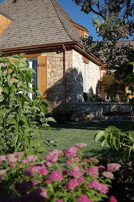
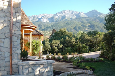 Here is a side view - a lovely landscaped path - notice the copper gutters and cedar shake roof. More spectacular mountain views.
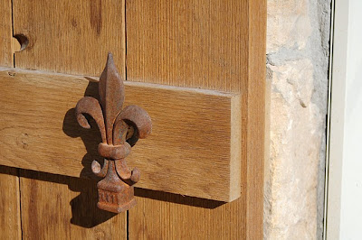
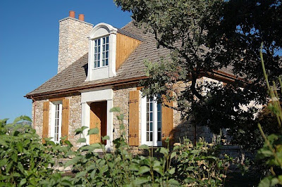
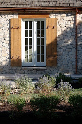 I adore the charm of these shutters!