The first house my husband and I lived in after we were married was an adorable 100 year-old little house in downtown Mesa, AZ. It was like a dream come true for me to finally have my own little home to decorate!
The house was old and drafty. The wood floors in the master bedroom were especially cold in the morning, so we opted for area rugs. There weren't the same kinds of online and discount options available back then (or at least I didn't know about them), and I thought it was way out of our price range to get large area rugs from the standard sources.
So we went down to Mesa Sales, where they sell all kinds of great fabrics and flooring, including carpet remnants. For our bedroom, we spent about $75 for a remnant of a wool carpet that fit perfectly in the room, just a few inches inset from the walls. I think it was about 14x16'. The carpet was gorgeous. It looked just like a seagrass or jute, but was super soft underfoot. For less than $2 per linear foot, the nice people at Mesa Sales bound the edges of the carpet remnant and made it look finished. It was really a nice and reasonably-priced solution for that space.
When I saw this image from House Beautiful, I wondered to myself if there was a way to use two different carpet remnants cut into strips to get this same look? Maybe some industrial strength duct tape on the underside to keep the strips together and then have the whole thing bound?
The house was old and drafty. The wood floors in the master bedroom were especially cold in the morning, so we opted for area rugs. There weren't the same kinds of online and discount options available back then (or at least I didn't know about them), and I thought it was way out of our price range to get large area rugs from the standard sources.
So we went down to Mesa Sales, where they sell all kinds of great fabrics and flooring, including carpet remnants. For our bedroom, we spent about $75 for a remnant of a wool carpet that fit perfectly in the room, just a few inches inset from the walls. I think it was about 14x16'. The carpet was gorgeous. It looked just like a seagrass or jute, but was super soft underfoot. For less than $2 per linear foot, the nice people at Mesa Sales bound the edges of the carpet remnant and made it look finished. It was really a nice and reasonably-priced solution for that space.
When I saw this image from House Beautiful, I wondered to myself if there was a way to use two different carpet remnants cut into strips to get this same look? Maybe some industrial strength duct tape on the underside to keep the strips together and then have the whole thing bound?

House Beautiful
Pretty, right? So many of us with young kids like the look of a graphic striped carpet, but want something a little more plush than a cotton flat weave. This could be a good solution. I might just give it a go in our next apartment.


 Pick up a copy of England's House and Garden or Home and Gardens' Magazines and you are sure to find the work of Interior Designer, Helen Green. She has wonderful streamlined, sophisticated style. Green describes her style as cool contemporary, modern, precise, harmonious and elegant. Above is London Triplex she recently designed for client.
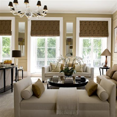 Her palette is often soft neutrals, which we all know I love here at Willow Decor. Green mentioned in a recent interview that in central London, with the homes interesting architecture, she felt color doesn’t really work. "In a sophisticated house where you’ve got a sophisticated palette of greys, for example, splashes of colour like a red cushion doesn’t work for me." Having moved into a historic home with many interesting architectural details I have also found myself moving toward a more neutral palette. Like Green, I felt this was a better way for the room to reveal its exceptional bones.
 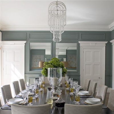 This is such a wonderful dining room. I adore the gray blue color scheme. Green keeps the architectural details the focus of this room but enhances them by accenting them with mirrors. Notice the mirrors incorporated into the wall panels above. And, if you look again at the living room photo above you will notice mirrors built in, flanking the windows.
 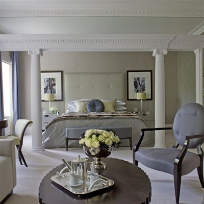 I love this master bedroom. The room's architecture is front and center and beautifully enhanced by a soothing palette of beige. The furniture is a mix of what we call classic contemporary. (The silver hot chocolate pot and the roses add the subtle bling!)
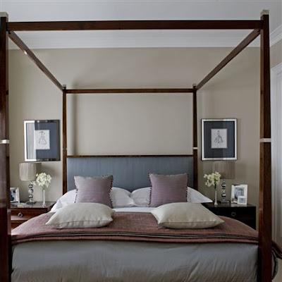 Above is the Guest room -streamlined, sophisticated and very inviting.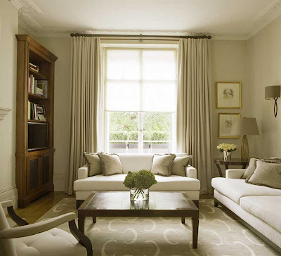

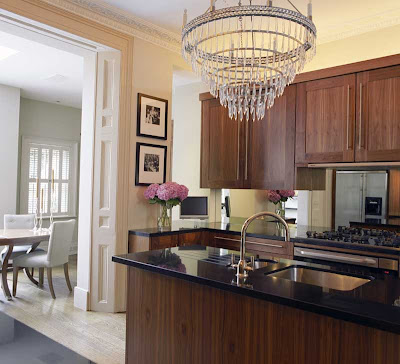 One of the designer’s favorite rooms is her kitchen, a spacious area that looks out onto the beautiful gardens. Though I personally prefer a white kitchen, I do like Green's cabinets. I think the wood tone is very rich and the crystal chandelier gives the space and unexpected glamour. Notice how similar her dining chairs are to the ones above in her clients dining room.