Showing posts with label Home. Show all posts

Monday, October 19, 2009

Happy Diwali!

Hello! How have you been?
I have been busy with Diwali festivities and a wedding in the family
Hope you all had an awesome Diwali
And celebrated the festival of lights
By lighting a diya or two

I will now catch up with you next week. Leaving you with some glimpses of the Diwali decor at home this year...


(all pics taken by me @ home)


[Blogger gave the option of posting extra large pics as I uploaded the pics, so trying that out. Let me know if it messes up the blog formatting/user interface for you...will get back to regular sized pics]

Thursday, April 30, 2009

Stumped

I know it was 'love it' or 'hate it' with Blueprint mag, but most of the time I loved it, and I was sad when they closed their doors. Just like Domino, a lot of the ideas and featured rooms from Blueprint stick out in my mind, even years later.

So what do you think I remembered when I saw these stumps for sale in the Pottery Barn catalog?

The red stumps! Remember when they featured Elena Columbo's small beach cottage?

image via flickr

I think a pair of PB stumps (or go find your own fallen tree and start hacking) and a quart of oil-based paint in a gorgeous, unexpected color - like red, mustard yellow or turquoise - would be amazing paired underneath an entryway bench.

My photoshop skills are not the best, but here's a doctored image to help give you an idea .

Image via Angie Hranowsky (photoshopped to include wooden stools)

Friday, March 13, 2009

Jewelry Storage Solution

For about a year, I considered buying a large jewelry box, like this one from PB, to help solve my jewelry storage dilemma. But, I decided to save the money and come up with another solution.


I bought this wall mirror/shelf from Target (it was on sale then for $20) and hung it on my closet door. I used four little white porcelain dishes (also from Target, for about a buck each) to separate everything out - bracelets, rings, earrings, watches, etc. I also added four small hook screws along the sides of the shelf for additional hanging area. Cheap and easy.


Plus, jewelry is beautiful and fun to display! And I've discovered that now I'm rotating into my outfits oldies-but-goodies because I can see all my jewelry options this way, rather than having to rummage through a giant box.

You can also see a little peek into my closet here. I papered it with some large sheets I had left over from a party. Paper Source doesn't accept returns on flat sheets, so I used some of the leftovers as wrapping paper and put the rest to good use in my closet.


It's sort of obvious that it's not real wallpaper, and it doesn't look perfect. BUT, the yellow matches my headboard and it puts me in a really good mood when I'm choosing the outfit du jour.


Happy Friday, friends! I hope your weekend is lovely.

Thursday, March 12, 2009

Bedroom Source Info

I received a few emails asking where I got some of the things in my bedroom, so I thought I'd throw it all out there. Let me know if I forgot something you're interested in knowing...


The duvet cover and shams are from Overstock (in Titanium).

The navy/white quilt is from the HomeGoods clearance section for $5.

The bolster pillow was made by moi with Chiang Mai fabric in the alabaster colorway (bought a remnant from eBay for cheap). I used this down pillow form from IKEA.

The art was thrifted or fleaed or bought on etsy. Most of the frames are IKEA Ribbas.

The steel "J & M" letters are from Anthropologie.

The mirror is also from Homegoods. I paid a whopping $17 for that bad boy. It was HIDEOUS when I bought it a year or so ago. I painted it the wall color (very roughly, so that you could still see the beaded detail in the moulding). I wanted it to sort of blend in with the walls, since our room is small. The mirror sure helps to brighten the room.


The powder-coated lamps are from IKEA and are totally worth the high-for-IKEA price tag.

The headboard was thrifted years ago and has been many, many colors during our time together. I like this mustard yellow incarnation though (Martha Stewart for Valspar (Lowes) "No.2 Pencil"). This color's holding the record for longevity so far.


The nightstands are vintage and mis-matched, but have been given the same coat of white paint for unity purposes.

The dresser was thrifted and painted MS "Gravel", a really beautiful shade of gray (if anyone is looking for a good one out there).

The glass water jugs on top of the dresser are from HomeGoods (they sell them at Anthropologie, too).


The kilim rug is from the IKEA as-is section. You can still buy it here.

And finally, the walls are MS "Cakestand Blue." Bright and fresh, but not 'baby boy blue'. Ya know?

I think that's everything. It's not really a "decorated" room, but it's cheerful, which makes me happy to wake up to every morning.

Friday, January 16, 2009

Office/Dining Room Update - PART 2

After painting the walls and updating the office furniture, the dining section of this room could use some help. The settee fabric has got to go.

Thanksgiving, 2008
In November, I bought a few yards of a Paul Kaufmann floral upholstery fabric (see above) at a fabric store closing liquidation. I used it to reupholster a settee I bought for cheap on Craig's List. I didn't pay much at all for the yardage (I think around $10 total), so I'm not feeling guilty now that I hate it.


Even though I'm not happy with the way the fabric looks in my dining room, we've still been using the settee at the table for a few months and we really like that arrangement. My kids love (LOVE) sitting there for meals and crafting. Which is fun, but also is sort of bad news for the very light colored fabric.

Now that the holidays are behind us and I have more time, I am ready to reupholster the settee again in something else. I have three requirements:

1. Must be a fun print.
2. Must be indoor/outdoor fabric to hold up to the kids.
3. Must coordinate with my beloved Chiang Mai Dragon upholstered chair. (I even think I'll have enough Chiang Mai fabric left over to make a long lumbar pillow for the settee)

After an extensive search of outdoor fabrics (there aren't many), I've narrowed my decision down to three:

1. Duralee's Pavillion in Basil (this is a nice, big print - the repeat is almost 14")

2. Waverly's Lovely Lattice in Lagoon (sort of a Kelly Wearstler vibe, right?

3. Robert Allen's Isle Damask in Dune (prob. my least favorite)

What's your vote? I've ordered samples of all three so that I can really see how they look next to the Schumacher Dragon fabric.


Also in the dining room is this pale blue china hutch (pictured below, behind the chairs), where I store some white china (in the shelves) and my glassware (on top). I keep my craft supplies organized in the drawers.

I am fine with the hutch as it is (plus, it's not in the budget to buy something different right now), but I still would like to do a little cosmetic update. For the six large main drawers, I like these antique brass bin pulls.


And for the two small drawers at the top, I'm liking the idea of brass ring pulls. I like that these are so thick and solid. Maybe I could oxidize these on my own to give them a dark finish to match the bin pulls??


I have some ideas for art and window treatment updates that I'll post on soon. In the meantime (and once I get the swatches of all my outdoor fabrics and of the Chiang Mai Dragon), I can make a final decision on the paint color and get out my roller and brush.

I hope you have a fantastic weekend!!

Thursday, January 15, 2009

Office/Dining Room Update - PART 1


My dining room/office needs a total overhaul. For Christmas, I asked for money to redecorate it. I can't wait to make some changes to the ugly room that you can see from every angle of my downstairs.

Even though we're moving in six months, it's worth it to me to make these changes now. And really the only investment we'll make that we won't be able to move with us is about $30 worth of paint. No big deal compared to the pay off. My philosophy is that it shouldn't matter if you're living somewhere for six months or six years. I feel better about life when my home looks and feels beautiful to me. Don't you?

First up on the to do list:

1. Change the paint color.

The mustard color is not good in here. I've pretty much hated it since I finished the last paint stroke about two years ago. I'm leaning toward something a lot less warm and much more neutral, like Benjamin Moore's Silver Fox - a nice taupe-y gray. It basically matches the gray linen on my dining chairs and will look nice with the blue gray currently on my living room walls. One of my favorite bloggers, Mrs. Limestone, used this color in her home renovation and I love it.


I'm also considering Sherwin Williams' Intellectual Gray, which seems to be a cleaner gray (can gray be clean? hmm), after seeing this post on Style Court.

2. Our old desk is NOT working.

We bought our pretty little writing desk at a thrift store a month or so after Michael and I were married and we refinished it together. We both had to let go of some sentimental attachments to the desk last week when we sold it on Craig's list (for twice what we paid more than five years ago!).

The little shelf was not quite deep enough for the iMac (two accidents too many there) and the height of the desk surface was uncomfortable for me (carpel tunnel, anyone?)
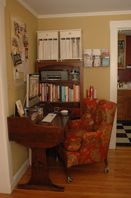

Since a lot of the furniture in this room is more feminine (scrolled legs, etc.), I decided we needed more balance and that the new desk needed to be sleek and straight-lined. I found this parsons desk on Craig's list for $25. (about $275 cheaper than the West Elm version I was looking for)

It's actually a table, because there are no drawers, but I plan to get this red filing cabinet from IKEA to fix that storage problem.
3. A new desk chair is immanent.

Over the summer while we were in New York and Brussels, the people who rented our house broke the legs on my pretty tufted office chair {tear}. As a replacement, I've had my eye on a nice, simple upholstered side chair that looks similar to this

or this.

You'd be surprised how hard it was for me to find anything even close to these chairs on eBay or Craig's List. Here's what I was able to find though:


Not too bad, right? But that blue velvet has to go.

Schumacher's Chiang Mai Dragon in aqua has been my fabric obsession of 2008, and I think my little chair would look amazing all wrapped up in this chinoiserie love.


I read online that the design originated from a 1920s block print that Schumacher associates found in an old English fabric archive. The print is so very Art Deco with the stylized Asian flowers, trees, lanterns and, of course, dragons. I am crazy about it.

Here are a couple of my favorite Chiang Mai projects that I've seen around the blogosphere.

Photos below of chairs at Boston-based Hudson, via Pink Wallpaper


photo below of Designer Jen West's daughter's bedroom, via Style Court.


photos below via Maison Luxe


Chiang Mai Dragon pillows via eBay UK, ($60, pair of two cushions)


Aren't the colors of this fabric just gorgeous? I think that's why I'm so excited about it - the colors are such a nice complement those in my living room (which is viewable from the dining area).


Stay tuned for Part 2 of the office/dining room redo...