Showing posts with label My House. Show all posts

Monday, March 29, 2010

Which Would You Choose???

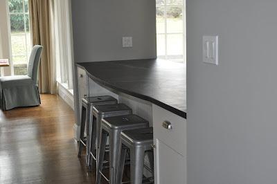
Here are my current wood counter stools with the Ballard Design toffee checked chair cushions. If you look closely you will see that the chairs are actually different. The two on the ends I bought at a discount many years ago because they were being discontinued by the manufacturer. When I needed an additional stool I bought a similar one from Ballard Designs.
What I like - the tall backs, the warm wood tones and cushions - over all the chairs are very comfortable for sitting. We don't like that we can only fit three stools. I have two children and when they each have a friend over, only three can sit. Also we don't' like how the stools protrude into the walking area.
Here are the Tabouret stools. Aren't they great?! Did I mention they were only $50 each - I am still giddy about this...you can find them here. What I like: Aesthetically I like their lines and the way their color ties in with the stainless steel in the kitchen. I love how four stools (and children) fit. I also like how they push in and make a clear pathway for walking by. I don't like how cold they are to sit on in the morning and how uncomfortable they are with out a back. I also worry they are just too industrial looking (a family lives here after all!)
.
So readers, what do you think?? Which do you prefer and why???

Thursday, February 25, 2010

Antique China

Today is the 79th Tablescape Thursdays over at Between Naps on the Porch, so I thought I would share with a you a recent gathering I had where I used my antique Johnson Brothers green china.

You might remember that one of my goals of my Butler's Pantry renovation was to build some beautiful glass front cabinets to house these precious antiques. You can read all about the Butler's Pantry here.
But what good is China if you are only going to look at it behind glass? I decided to set it out for everyone to enjoy. You can see the antique soup tureen above.
I used Lemon Cypress trees as the centerpiece and pulled out my Apilco chocolate cups for individual arrangements at each place setting. I just put in a spring of greens and some berries.
You can see the bone dishes on the right - we used these as interesting bread plates.
And the covered dish held butter pats I made in pretty butter molds. I should have taken a photo of those!
I'll reveal the rest of the Dining Room on Monday but until then remember to enjoy your china and don't just keep it hidden behind glass.

Head on over to Tablescape Thursday to see more wonderful tables!!

Wednesday, February 24, 2010

About the Italian Chandelier!

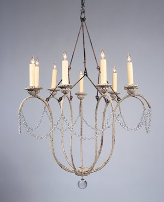
Many of you have emailed me asking more information about my chandelier. My interior photography is ever evolving (aka. not very good) and many of you wanted better photos. I was unable to get them because of the light. If you click on my photo above it should enlarge and give you more detail. But, if that does not work for you, I did have a few professional shots of the chandelier in my inspiration files.
The chandelier is made by Niermann Weeks. It is called the Italian Chandelier and comes in both 9 arm and 12 arm sizes. The photo above shows what is considered the standard finish - a distressed, chippy white. My chandelier was custom finished in an antiqued silver - it has a beautiful depth of color. Niermann Weeks has many many different finishes to choose from.
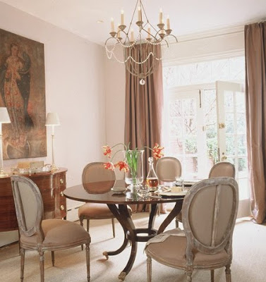
This photo from Things that Inspire via Anne Hepner gives you a very good shot of the piece. This example shows the fixture with shades, which I opted not to do. Here you see how nicely it looks in an informal room. This photo from Things that Inspire via Caldwell Beebe gives you a clear picture of the crystals that surround the fixture. I like the sparkle the singular strand brings to the room. It add a interest but its not too fussy. This room is also lovely, though a bit more formal than my breakfast room, but notice the similarities in the chair style and curtain selection.
I am sure you recognize this room from Better Homes and Gardens, which has been all over the blogs. Here you can see an example of the 12 arm style.
Niermann Weeks writes about the Italian Chandelier on their website.
They first found antique sconces, which led to the design of the chandeliers. They mentioned that English designer Nina Campbell hangs the Italian chandelier in her own bedroom, and every time she’s moved, it’s moved with her. The photo above is not Nina Campbell's bedroom, but another gorgeous room from the talented Catalano Architects.
'
Holly at Things that Inspire did a wonderful, comprehensive post on the Joe Niermann and the Niermann Weeks company. To read more about it click Here
'
The Niermann Weeks Company also writes an interesting article about how the design of the Italian Chandelier came about. To read more click Here.

To read more about my Breakfast Room click Here. Let me know if you have any other questions!

Thursday, February 18, 2010

My Breakfast Room and Family Room Reveal

When I bought my house I knew we would need to enlarge the kitchen and family room area. The previous owners were empty nesters and although the layout worked for them, it was not appropriate for our growing family.

This before picture was taken during our home inspection. At this point the previous owners had removed much of their family room furniture - all that remained was their small kitchen table and some odd chairs. You can see that the wall of windows was about 3 feet beyond the solid wall. A larger table would have ended up looming into the Family room space. So, when we were ready to renovate we pushed back the wall and added an additional nine feet to create a dedicated breakfast room. Here is the breakfast room after!

We recessed the ceiling and added beadboard and crown moulding to match the treatment we added in the kitchen.
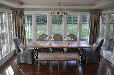
I vacillated for months over the light fixture, but finally decided on the Niermann Weeks Italian Chandelier with an antiqued silvered finish. (Actually I vacillated over spending the money or not spending the money - I always knew it was just perfect) In the end, it was my husband's sage advice that made me order it - "You will look at this everyday, all day, for years - buy what you love!" I am so glad I listened to him (He says its one of the only times!)
Here you can see that we added three windows on each side to keep the original feeling.

I found a wonderful Belgian wrought iron table with old wood top that fit the space perfectly. Wisteria had a bench that was just the right size and I topped it with a grainsack! The linen curtains were a steal, only $20. a panel, a close-out from Country Curtains; all they needed was a little doctoring.
You might remember that at this time I also took out the over head cabinets between the Family Room and Kitchen area and removed four lower cabinets to create more of a center island.
Here you can see how much better the space feels. Removing the upper cabinets also allowed you to see the recessed ceiling area in the kitchen. We spiffed that up a bit by adding the beadboard and crown moulding details.
Here is the Family Room before. This is directly across from the center island. The size is deceiving as the back wall is over 13 feet wide.
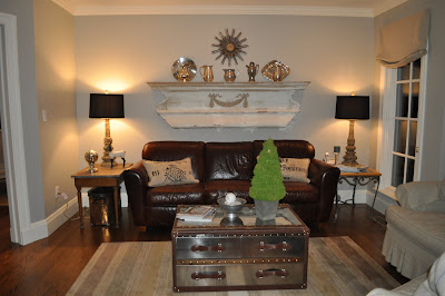
Here is the Family Room after. We added the window on the right to match the rest of the back. It was a great addition as it brings in so much light to what used to be a shadowy area. The mantel above the couch I found in the trash on the side of a road many years ago. It has an original workman's label from 1881. What a find!! I just love the feeling it brings to the space. Lamps are from Aidan Gray and the mirror is from Wisteria - It came in gold so I silver leafed it one afternoon.
Here is the before looking from the Kitchen area out toward the Family Room area. Notice the wonderful ceiling detail that was hidden from view before we removed the upper bank of cabinets.
And here is another photo of the after. Notice the addition of the crown moulding. The chairs are my old yellow club chairs, slipcovered in the same close-out linen from Country Curtains- a steal at $6 yard. I think they are bit oversized, but until I find what I am looking for they were an inexpensive fix. Here is the TV cabinet - notice the size of the TV that fit in it.

We added a gas fireplace, mantel and surrounded the area with crown moulding. We also placed a much larger TV above. Winter is long here so the fireplace makes the space so much more cozy.

This is the full view of the new space if you are standing in front of the fireplace.

From this...

To this...
(click to enlarge)

A final thought - I have received some email recently about rooms done by decorators that are considered "high-end" and not accessible to the average person. I just want to share with you that not all things that look expensive actually are expensive. Beauty does not have a price tag. Do not be afraid to mix $20 curtains and mantels you find in the trash with expensive chandeliers, or reproductions from mail order catalogs with real antiques. Trust what you love and it will all come together. It's not about the price, it's about surrounding yourself with things you enjoy.

We really enjoy our new space - I hope you do too!!
To see more of my house click here.
(all photos Willow Decor please do not copy without permission)

Saturday, December 19, 2009

My Living Room Evolution

I wanted to share with you the evolution of my living room.
(click on any photo to enlarge)
My living room is a warm and inviting room with windows on two sides and sun coming from a third side through the Conservatory. I have always been hesitant to cover the windows with any window treatments - as I hate to block any light. But, clearly my living room needed some softening. Above is the before.
After a long search for perfect Belgian linen and a tutorial from Joni at Cote De Texas on curtains (do click this link - it is a fabulous resource) the day came to have the drapes installed. I hired a professional drapery installer. I am a good at many things, but this area is best left to a professional.
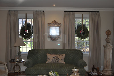
Here is the after (please disregard the wreaths in the windows as they are part of my holiday decor.) The curtains are Parisian pleat tops, double window width with a trouser break bottom. The rods are hand forged iron and sent up from New Orleans by my dear designer friend, Millie. You can see the richness and softness the new window treatments bring to the room.
Here is the living room from another angle. You can see my cherished Mora clock to the right. For the story on how I acquired that clock click here. Notice the sweet Gustavian chair in the bottom right of the photo.
Here are the Gustavian chairs from another angle. The painting is a lovely work by Cape Cod artist, Anne Packard. We usually put our Christmas Tree here.
This angle is taken by standing at the Mora clock. Also notice my new "soft" seagrass rug- which really is very soft with white cowhide rug overlay - to learn more about cowhide rugs click here.
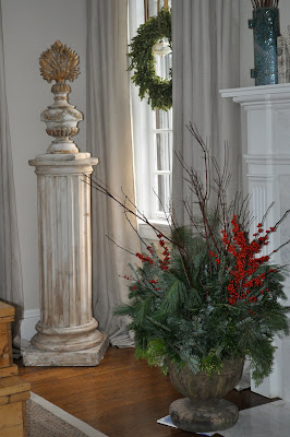
I added a few more holiday decorations in this shot. Notice the garden urns by the fireplace filled with berries, branches and evergreens.
I added more oversized mercury glass ornaments to compliment the ones on the mantel and also to pick up the sparkle from the mirrored trees in the Conservatory. I also love the texture and smell of the Rosemary Topiary trees.
Finally here is a close up of a reliquary and pedestal, as well as a close up of the garden urn. I love the warm colors and the way that the evergreens and mercury glass add a holiday sparkle to my room. Let me know your thoughts, should I add more holiday decorations or leave it as is?
(all photos property of Willow Decor)

Wednesday, December 9, 2009

My Conservatory, Framed Intaglios & Holiday Decorating

One of my favorite rooms in my home is the Conservatory. It's sort of a Garden Room and Music Room in one.
(click on any photo to enlarge)
It sits directly off our Living Room. You can see a bit of the green Living Room couch in this photo. The Conservatory is fairly large as it houses both a seating area and baby grand piano.
My favorite features are the mouldings and the huge arched french doors which lead out to our brick patio. Sun pours in from three sides of this room, including the front windows in the living room. It has gorgeous light through out the day.
Here is how it looks most of the year. You can see the greenery through the windows. The light in the photo is not the best, but it gives you the general idea.
On the wall opposite the piano I recently purchased a set of nine intaglios from Things that Inspire's new business venture, Quatrefoil Designs. TTI was so helpful to me. We decided on a "gliver" frame color (a cross between silver and gold) which really compliments my other artwork in the adjacent living room. Instead of paper matting, TTI was able to use the remnants of my 100 year old antique linen from my Swedish furniture re-upholstery project, as the background mat for the intaglios. They turned out stunning.
Hanging them proved to be a tedious task. My sweet husband spent several hours making sure they were straight and symmetrical. He's so good at math and so patient! Thank goodness opposites attract!
The finished wall turned out better than I could have hoped. The texture of the antique linen mat is such a wonderful compliment to the Swedish furniture. I hope to eventually find some beautiful sconces to hang on either side.

The Intaglios are very high quality and the price is very reasonable. If you are thinking of adding a set to your home do check out out Quatrefoil Designs.
As I mentioned the French doors open to the backyard and the brick patio.

I love the mossy brick and old stone walls. Both are original to the house; over eighty years old.
I have posted so much about not over doing the holiday look but working to enhance your already beautiful rooms. I wanted to share with you some of my Holiday decorating. The "bones" of my house are so lovely. I also adore my antiques and do not want to have them get lost because of over zealous holiday decorating. Each year I edit and use less decorations, but it seems my house still looks festive. Here is the Conservatory as it looks most of the year. (Well actually without action figures, ipods or dog bones laying around)
Here is the room decorated for the Holidays, just after we got a few inches of snow. I have a collection of antique Mercury glass, mirrored and silver glitter trees. They look gorgeous on the piano and the pedestal. They catch the light and all the day the room just sparkles.
Here is a close up of the piano during the year. The crown sits on its own pedestal behind the piano.
I just replaced the fresh flowers with the silvery trees and relocated the crown to the table in the seating area. Notice the sparkles of light on the doors to the right. All day the light sparkles move around the room.
And here is a close up of the newly upholstered Swedish chair (read more here) and Tara Shaw Maison iron table (read more here). I just added another needlepoint holiday pillow and a mint julep glass with holiday greens for a festive touch. Simple, but beautiful.

Over the next few days I will post the rest of my house decked out for the holidays. And if you hear singing, its most likely me Fa la la la-ing!!

(all photos property of Willow Decor - please link)