Showing posts with label interior design. Show all posts

Wednesday, April 7, 2010

Annette Tatum Book Signing and Giveaway


Annette Tatum, design guru and author of The Well-Dressed Home will be in San Francisco Tuesday, April 13th and would love for you to drop by her book signing from 6-8pm. RSVP to April13benefit@gmail.com. All proceeds will benefit Summer Search.

In addition, it's not too late to enter to win a copy of Annette's book, The Well-Dressed Home. Go here.

Hope to see you at Annette's book signing!

Thursday, April 1, 2010

Annette Tatum ~ Interview & Book Giveaway

Recently I featured Annette Tatum's gorgeous new bedding collection from her interior decor lines House and Little House in this post. Today I am thrilled to interview her and giveaway her new book, The Well-Dressed Home. This book is an inspiring resource that merges fashion and home decor styles. It also guides you through beautiful images how to decorate your home by embracing your fashion sense.

SB: Where did you get the inspiration for your new bedding collection? Do you have a favorite print?

Annette: I get a lot of ideas from fashion. I love the way the that industry forecasts new looks. I also have a library of architectural components such as tile patterns, iron gate designs that I source new ideas and patterns from. And then there is the one of a kind textile documents that you can find at a flea market or little store that hold a treasure of ideas to be put into print.

SB: How would you describe your personal style?

Annette: I tend to like a little of everything, but for the most part I am pretty classic. I like designs with historical references and that have stood the test of time. My own home is full of traditional design but layered in are the bohemian and vintage elements that I love. A little bit of Audrey mixed with Alexander McQueen is my favorite. The expected mixed with the unexpected.

SB: Has your personal style changed or evolved over time and how?

Annette: My lifestyle has definitely changed over the years from single girl to mother of four. So my personal style has changed from everything to what I wear to how my kitchen is laid out. Where I am in my life has such an impact on how I live. Four small kids.. easy to wear furniture and clothing.. When I was single.. much more mod and sleek. So just like my wardrobe I have stopped wearing mini skirts just like my home I no longer have such a formal dining room. I think as that as time goes on I find myself more attracted to simple yet elegant design. Both in my own personal style and my home.
SB: In your own home, what is your favorite room and why?

Annette: We have a little room off our master bedroom that is probably 8 x 8. We all love to hang out in there and watch TV or click on the computer. I just added seagrass to the walls and the book cases are a Wedgewood blue. It feels like a very cozy little English den.
SB: What trends are you seeing in your projects right now?

Annette: In my new book, The Well-Dressed Home I cover eleven different styles in home decor and fashion. I am seeing that the two are more and more blended and using that for inspiration. What ever is on the runway makes its way somehow in some form to the home decor market. Fashion adds drama and exciting to design and that trend is what I am looking at for my own line.

SB: You have been a successful interior designer, author and business woman with decor lines House and Little House. Do you enjoy one more than the other? What is next on your career agenda?

Annette: It has been quite a ride and I am often looking for ways to slow down! But recently we designed a group of one of kind dress forms for the book tour that are amazing. Dresses made out of home decor materials such as wallpaper, tile, hardware and more. They were so fun to work on and the hands on creating is what I really miss. I hope to do more of that in the future. I love the idea of " bespoke" tailoring and think that adding more of that to the products I make is exciting.. and maybe another book! {for "The Making of the Mannequin Exhibit" go to Annette's blog here}
To celebrate Annette's book, Simplified Bee will be giving away a copy of The Well-Dressed Home to one lucky reader. Here's how to enter:

*Leave a comment.
*Extra entry - Follow Simplified Bee™ Blog (by adding yourself to the follower group on the sidebar) or follow Simplified Bee on Twitter.
* Extra entry - mention this giveaway in a post or tweet and leave a comment letting me know you've done so.
* Please post a separate comment for each extra entry.
* Entry period closes at midnight PST, Sunday, April 11, 2010 and the winner will be announced Monday, April 12, 2010.
*Note: The winner will be drawn randomly using Random.org, notified directly via email and listed back at this post using first name only.

Wishing you a wonderful day!
*images courtesy of Annette Tatum

Monday, March 29, 2010

More Designer Living Rooms in Green

This beautiful living room designed by Tobi Fairly of Little Rock, Arkansas recently featured here and on Odi et Amo had me thinking about one of my favorite colors, green. Last year, I featured a post on living rooms in the hue of green and wanted to share some more great examples.

Speaking of Tobi Fairly, she was recently interviewed on The Skirted Roundtable. Tobi is so talented and charming too.

Lauren Liess, an interior designer and fellow blogger of Pure Style Home features green in her own living room shown above. She bought {scored} the Lee Industries sofa off Craigslist and had it reupholstered in a bright green velvet {her favorite color}. The sofa looks amazing paired with her lucite coffee table, table lamp from Pottery Barn and mirrored reproduction French flea market nesting tables from Crate & Barrel.

In this living room the designer {unknown - let me know if you know!} a traditional sofa in green looks sharp with coordinating graphic pillows. The white shag rug and glass round coffee table provide modern elements. The beautiful yellow blossoms behind the sofa adds height and pulls the yellow accent from the middle throw pillow and books on the side table. Photography by Anna Williams.

Jonathan Adler creates a beautiful living room in a green, yellow and brown color scheme. The sofas are covered in kelly green which contrasts nicely with the yellow trim detail and white legs. Adler mixes vintage, modern and traditional styles with ease. I particularly like the dramatic floor length drapes, white lacquer coffee table and yellow and white geometric rug.

Interior designer, Pheobe Howard is known to use green throughout her creations. This gorgeous living room by Howard showcases green with both dark and light furnishings. The airy white upholstered sofa is beautifully contrasted with heavier dark wooden casegoods and carved chair. The pair of green and white geometric slipper chairs adds a fun contemporary element. I am also loving the natural bamboo stools!

The living room beautifully painted in leaf green by Billet Collins is reflected in a stunning over-sized mirror. To balance the color scheme, upholstered chairs and the rug are in a neutral white.

Do you love green too?

Thursday, March 25, 2010

Gorgeous Hand Painted Designer Floors by Billet Collins

Do you remember this cover of Veranda January/February 2009? The sitting room features a stunning painted floor by Washington, DC's most influential decorative painting studios, Billet Collins.

Billet Collins is known for their innovative hand painted finishes and dramatic patterns as shown in the dining room above and previously featured in Designer Dining Rooms and Decorating Tips.

In addition to painting gorgeous murals and textiles, Billet Collins loves to create painted floors and it's one of their specialties. Kellie Hodges of Billet Collins explains, "The layout is extremely important to us so we use a lot of math and geometry to make it layout, and to make it perfect we practice a little illusion!" The foyer above is a beautiful example of one of Billet Collins' geometric painted floors.

They do not use stains, but use custom tinted glazes to coordinate with the wood tones that give the artists better control. This allows for the grain to still come through and a natural progression of colors.

In this foyer, Billet Collins painted the wood floor in vibrant colors that are also either sheer colors or opaque for a more painted effect.

The process is easy. First the floors are first "screened" {a light sanding} to provide some tooth. The the floors receive one coat of sealant to keep the glazes from running into the actual wood, which keeps the colors from bleeding and the pattern crisp. Next the pattern is applied {usually a couple of days} and then the top coats go on. Billet Collins also likes to use a water based urethane so our colors don't yellow.

I am loving this look. How about you?

If you'd like to use or publish any photos or material from this site, please contact me, credit Simplified Bee™ and kindly link back to this blog.

Monday, March 22, 2010

Sweet Pink & Yellow Baby Girl Nursery by House of Ruby

Whimsical, chic and opulent. This darling nursery room was created by San Francisco Peninsula-based interior designer, Melodie Rubin of House of Ruby.

Starting with existing white on white polka dot window treatments, Rubin creates a bright and beautiful yellow, pink and white color palette that is not typical, but yet still feminine and shouts, "It's a girl!" The sunshine yellow wallpaper by Nina Campbell is a nice backdrop to the nursery's focal point and inspiration, a white Sutton Canopy Crib by Restoration Hardware. The crib with a four poster bed look converts to a toddler bed and is dressed in crib bedding custom made from Serena & Lily's Ruby/Sunshine Mosaic Fabric.

An antique, hand painted side table handed down from a proud grandmother was placed next to the custom glider - arm chair by Patricia Edwards {available through the trade or Posh Tots}. A throw pillow by Trina Turk pulls the color scheme together nicely and mixes in a modern touch.

The exquisite round tufted ottoman is worth a closer look. Like the chair, it is covered in solid bubblegum pink and contrasting pastel pink dot fabrics both by Designers Guild {available through the trade at Osborne & Little}. The cord and trim add a touch of whimsy and are both from Fabricut.

Here's another look at the darling ottoman. The diamond pattern area rug is made from 100% New Zealand Wool Berber and is by Masland Carpet Mills.

I love this nursery design by House of Ruby because it has range and can easily evolve into a toddler and little girl's room. What do you love about this sweet nursery room?

House of Ruby

*images courtesy of House of Ruby and Kira Shemano Photography

Wednesday, March 17, 2010

Irish Eyes are Smiling

May you always have

Walls for the winds,

A roof for the rain,

Tea beside the fire,

Laughter to cheer you,

Those you love near you,


And all your heart might desire!


~ Irish Blessing

Happy St. Patrick's Day to you!

Wednesday, March 10, 2010

Designer Dining Rooms and Decorating Tips


Although similar in function, dining rooms can vary greatly from home to home. Dining rooms may differ in formality, size and style. However, when decorating the dining room there are several basic design elements that remain the same. Here are some tips for decorating your dining area.


The Table - When selecting a dining room table, it's important to determine what shape, size, material and style would work with the space, budget and your families' lifestyle. For example, a round table is wonderful for conversation, but can't accommodate as many guests as a large rectangular table. The table's material (i.e. glass, hardwood, marble, etc.) should also be taken into account and will further communicate the room's mood. An elegant mahogany dining table would be a good choice for a large, formal dining room, while a round glass table would be a nice choice for a smaller dining area because it would promote a sense of space. Each material has its pros and cons as well. Hardwood tables will be durable and long-lasting, glass will attract dust while marble, if not kept sealed, will stain.
 
In the formal dining room above, San Francisco-based designer Kendall Wilkinson anchors the room with an elegant oval dining table. The dark wood beautifully contrasts the room's neutral color palette. The fabulous pearl mosaic wallpaper and glass chandelier again add a sense of formality to the room.


The Chairs - It is best if you choose a table first and then chairs {but, of course there is really no rule when it comes to design}. Ideally chair backs should be higher than the table. A standard table height is 29” or 30” and seat height is 18”. If possible, test a chair out for comfort before buying. A bench (without a back) can look great at a dining room table, but may not be relaxing enough for a long meal.

San Francisco-based, designer Kimberly Ayres selects crisp white Chinese Chippendale arm chairs with citrus cushions in the dining room above. The chair is one of my favorites because of the fretwork back, comfy cushion and ethnic flair. It looks like it is from Jonathan Adler, but I am not 100% sure.

The Lighting - Generally the bottom of a hanging fixture should hang 30” to 34” above the table. A traditional crystal chandelier is always elegant, but you may want to also consider other styles such as pendants, lanterns and modern fixtures in a variety of materials (i.e. wood, metal, plastic). Adding wall sconces and table lamps are a great way to layer the room's lighting and create some drama. Also, consider putting all lights on dimmer switches so that you can adjust the room's mood.

It is also fun to mix up styles as in the dining room above by designer Tami Wassong. The whimsical vintage chandelier is a wonderful juxtaposition to the traditional table and chairs. Wassong layers the room's light by adding sconces flanking a mirror.


The Buffet - A buffet table, sideboard or storage console can be another beautiful design element in a dining room and a very practical one. Many store dishware, linens and table decor. In addition they provide a place to display fresh flowers, ceramic vases and table lamps. 

The stunning dining room above by New York-based Parlor Design (featured in this post), showcases a gorgeous custom credenza with metal inlay from the Parlor Design furniture collection. The silver floral wallpaper and ice blue upholstered chairs are exquisite.


For a classic look, consider hanging a mirror or piece of art above the buffet. In this lovely dining room, designer Billet Collins hangs a large rectangle mirror above a sideboard table. The hand painted landscape mural is a beautiful addition to the room.
 

The Rug - If you have a hard flooring surface and want to help define the dining area, adding an area rug is a good option. When selecting an area rug make sure when the chairs are pulled back to accommodate guests while seated, that the entire chair rests on the area rug. You want to avoid having the back legs on the hard surface and the front legs on the area rug.

In this beautiful dining room by California-based designer Erinn Valencich the black and white rug demands our attention and helps define the space. The rug's pattern also echos the more refined black and white pattern in the drapes. I love the fact that this room is not matchy-matchy and that Valencich selects a chartreuse geometric fabric to cover the dining chairs.

Remember these are simply decorating tips, not rules. There is no right or wrong when it comes to interior design. So, have fun with it!

* images courtesy of Decorati and Marnie Rose Agency

Wednesday, March 3, 2010

Mr. Smith - Classy, Timeless and Iconic

I've been having some terrible issues with my laptop and as a result, have not been able to access Windows Live Writer, which is where I create my blog. So, while I am still trying to get it fixed, I am going to republish my very first post I ever did on my blog, which was about Michael S. Smith, the interior designer, whom most of you probably already know, is the person that was selected to design the White House for the Obama family. Enjoy (again!)
I would like to focus my first blog on my favorite interior designer..... Michael S. Smith. He is one of Architectural Digest's 100 Top Designers, has had his work published in too many publications to count, is frequently hired by the wealthy and by celebrities and does a lot of hotel designs and renovations. The man is a genius! Everything he touches looks like it has been there for 100 years, but he has a way of making it look new, fresh and classic. You want to stare at his designs for hours, yet nothing jumps out at you and says, "I've been decorated". His designs are very unassuming.
He isn't afraid to combine different styles, periods and colors, which a lot of designers have a hard time doing. He exemplifies what I hope to achieve with my interior design. I appreciate his deference to classical design, but I also admire his willingness to mix modern elements ingenuously into the palette.


Michael S. Smith

Photo courtesy of his website

http://www.michaelsmithinc.com/


He has a new book coming out that I can't wait to read! It's called Michael S. Smith Houses. Together with Christine Pittel, he has created another book that walks the reader through his design process. His first book, Elements of Style is my favorite design book to reach for. It has a permanent place on my coffee table.

Michael S. Smith Houses, Photo courtesy of Amazon.com


Michael S. Smith Elements of Style, Photo courtesy of Amazon.com

If it is anywhere near as good as his first book, I'm in for an afternoon of lovely reading (and daydreaming!) at my patio table with a tall glass of iced tea!


Photo from Sunset.com (Sunset Magazine)

This isn't my patio, but mine is similar to this. I love the feel of the open fireplace with the seating group around it. It's very cozy, very welcoming and wonderful for long, lazy summer evenings!


Private Homes Designed By Michael S. Smith
(from his website...www.michaelsmithinc.com)


Malibu Home designed by Michael Smith


Cindy Crawford's Malibu home...Note the Bali influence in the dark wooden table, chandelier and stool with the fretwork. Michael Smith uses pieces that blend with the environment and the architecture, rather than competing against it. Wouldn't you just love to have this space to relax in and overlook the ocean? Ahhhhhh....
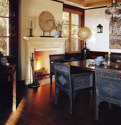


Dining room from the same Malibu home. Love the dining room table and chairs. And check out that ultra-cool chandelier.


Another room from the Malibu Beach House. Although simplistic in nature, the monochromatic design scheme is perfect for this home which has dark panelling, flooring and a crisp marble fireplace surround. The tufted chaise lounge is classic. It's a perfect place to curl up with a good book in front of a warm fire in the Fall. Notice how Michael added a dark wood mirror above the fireplace to tie in the dark panelling of the room. It's the details that make the room.


Palisades Home designed by Michael Smith. The fauteuil chair stands out as a "head of the table" effect in this sitting room. It's effective because all other seating in this view is basically at the same height and is more traditional in nature. To add a classic piece like this adds interest to the room and completes the seating group. Keeping the coffee table simple and with open iron legs is perfect. I want this coffee table to display more of my design books (including Michael Smith's new book shortly!).


Michael's Product Lines


Photo courtesy of Michael's website

This is Michael Smith's bathroom line for Kallista. Again, his classic detailing comes through loud and clear.


Photo courtesy of AnnSacks.com

Ann Sacks Tile Collection by Michael Smith

A "relaxed but polished look". Love it!


Photo courtesy of MansourModern.com

Refined yet casual rug collection for Mansour Modern.

Photo courtesy of agrigaria.com

Home Fragrance Collection for Agraria by Michael Smith


Photo courtesy Visual Comfort and Co.

Lighting Collection for Visual Comfort and Co.


Hotel Designs by Michael S. Smith


Shutters on the Beach Hotel

Michael remodeled the interior (I believe) in 2006, keeping the fresh, beach aesthetic.


One Pico Restaurant at Shutters On the Beach in Santa Monica, California. Michael Smith renovated this restaurant, which re-opened in April this year. The picture on the left is the old room, the rendering on the right is Michael's design.


Shutters On The Beach Guest Suite. Very beachy and there is that standing floor lamp that Michael loves.


Shutters On The Beach Bathroom. I love the cool grey tone on the walls. I can't tell what flooring material is used, but the dark floors make the grey walls and white tub and sink look fresh and crisp - just as a beach bathroom should be. Note that Michael used dark wood on his mirror again to tie in the flooring. The shutters looking onto the bedroom area and the louvered closet door to the left of the sink are a slight nod to the hotel's name.


Rendering of The Canary Hotel, Santa Barbara, California


Canary Hotel in Santa Barbara, California. Patio area and pool. Very beachy and very California. Outdoor fireplaces are popular here in California because of our climate. With the prices of homes here, it gives us another "room" in which to spread out!


Canary Hotel Guest Suite. Fresh bedding and draperies gives this room the light and airy feel. It would seem that Michael likes the turnstile design of the bedposts, as he echoes that in other designs.


Canary Hotel Bathroom


Canary Hotel Outdoor Fountain. Note how the light fixture has the same design motif as the plant holders.


I believe this is the Canary Hotel Lobby. I love the tapestry on the wall, as well as the wooden side table used next to the chair and ottoman.


Canary Hotel Patio.


(all Canary Hotel photos courtesy of Yahoo Travel website)


The Lowell, New York, Deluxe Room


I like the striping on the headboard canopy and table skirt which juxtaposes the toile-like effect on the pillows and bedskirt.


The Lowell, Garden Suite

The wallcovering, mirror and metallic fabric on the throw pillow really make this room fabulous.


The Lowell, One Bedroom Suite

Check out the symmetry!


The Lowell, The Painted Room

LOVE the mural and the carpeting. Again, the metallic fabric on the throw pillow adds just that bit of sparkle to the room.


The Lowell Penthouse

Set up a bit like the one bedroom suite with the symmetry, but none-the-less, it's classical design that best fits a conversation area.

If you have more Michael S. Smith photos you would like to add to my compilation, please email them to me! I'd love to add them to my blog!

I hope to be up and running soon with a new blog post for you all! In the meantime, have a wonderful week everyone!